
Issue
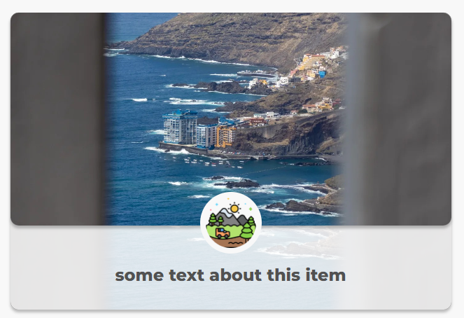
I made a component in React + SCSS. It works as it should on Chrome:
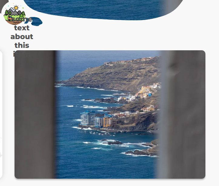
But when I open the same page in Firefox, it moves top left and looks weird:
What do I have to change to make it work on Firefox (and all other browsers)? I suppose that the problem is in relative and absolute positioning of elements, but I don't know where exactly.
.main-country-post-container {
  position: relative;
  cursor: pointer;
}

.main-country-post-bg-image-container {
  width: 100%;
  height: 256px;
  filter: blur(4px);
  box-shadow: 0 4px 4px rgba(0, 0, 0, 0.25);
  border-radius: 12px;

  img {
    object-fit: cover;
    height: 100%;
    width: 100%;
    border-radius: 12px;
  }

  &::before {
    content: "";
    display: block;
    position: absolute;
    top: 0;
    left: 0;
    width: 100%;
    height: 100%;
    background-color: rgba(256, 256, 256, 0.85);
    border-radius: 12px;
  }
}

.main-country-top-layer {
  position: absolute;
  top: 0;
  bottom: 0;
  right: 0;
  left: 0;
}

.main-country-post-top-image-container {
  height: calc(256px - 108px); /* 72 */
  filter: blur(4px);
  box-shadow: 0 4px 4px rgba(0, 0, 0, 0.25);
  border-radius: 12px;

  img {
    object-fit: cover;
    height: 100%;
    width: 100%;
    border-radius: 12px;
  }
}

.main-country-icon-container {
  position: absolute;
  display: flex;
  justify-content: center;
  width: 100%;
  bottom: 88px; /* 48 */
}

.main-country-icon-circle {
  background: #ffffff;
  border-radius: 50%;
  padding: 4px;
  display: flex;
  justify-content: center;
  align-items: center;

  img {
    width: 36px;
    height: 36px;
  }
}

.main-country-post-text-container {
  position: absolute;
  bottom: 0;
  width: 100%;
  height: 104px; /* 72 */
  display: flex;
  justify-content: center;
  align-items: center;
  padding: 24px 16px;
  font-weight: 800;
  font-size: 20px;
  text-align: center;
  color: #555555;
}

@media screen and (min-width: 768px) {
  .main-country-post-container .main-country-post-bg-image-container {
    height: 100%;
  }

  .main-country-top-layer .main-country-post-top-image-container {
    height: calc(100% - 120px);
  }

  .main-country-top-layer .main-country-icon-container {
    bottom: 80px;
  }

  .main-country-top-layer .main-country-icon-circle {
    padding: 8px;

    img {
      width: 72px;
      height: 72px;
    }
  }

  .main-country-top-layer .main-country-post-text-container {
    height: 100px;
    font-size: 20px;
    padding: 12px 24px;
  }
}

@media screen and (min-width: 1024px) {
  .main-country-post-container .main-country-top-layer .main-country-post-text-container {
    font-size: 24px;
  }
}
<!DOCTYPE html>
<html lang="en">
<head>
<link rel="stylesheet" href="path/to/MainCountryPost.css">
</head>
<body>
<a href="/" class="main-country-post-container">
<div class="main-country-post-bg-image-container">
<img src="https://www.copahost.com/blog/wp-content/uploads/2019/07/imgsize2.png" alt="post-bg-image" />
</div>
<div class="main-country-top-layer">
<div class="main-country-post-top-image-container">
<img src="https://www.copahost.com/blog/wp-content/uploads/2019/07/imgsize2.png" alt="post-image" />
</div>
<div class="main-country-icon-container">
<div class="main-country-icon-circle">
<img src="https://www.copahost.com/blog/wp-content/uploads/2019/07/imgsize2.png" alt="icon" />
</div>
</div>
<div class="main-country-post-text-container">
some random text
</div>
</div>
</a>
</body>
</html>When I add fixed width and height:
  .main-country-top-layer {
    position: absolute;
    top: 0;
    bottom: 0;
    right: 0;
    left: 0;
    min-height: 200px;
    width: 500px;
    background: red;
My div appears, but I would like it to be responsive, not to use hardcoded values.

Solution
The problem was in display and height:
when I added
.main-country-post-container {
  position: relative;
  cursor: pointer;
  display: inline-block; // new
  height: 100%; // new
it worked as expected
Answered By - Skar


0 comments:
Post a Comment
Note: Only a member of this blog may post a comment.