
Issue
I want to have a div section that fills its div parent as much as possible while maintaining a ratio.
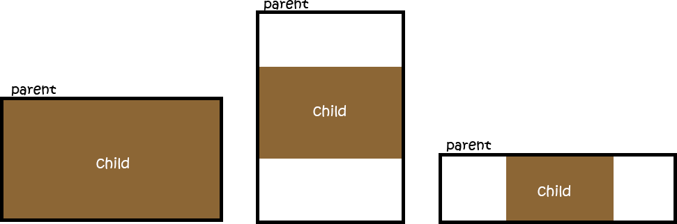
the render result would be like this:
What I do have so far:
html,
body {
  height: 100%;
}

.parent {
  /* Parent's height and width are unknown,
     it could be dynamic, e.g. parent is part of a flex layout. */
  height: 80%;
  width: 90%;
  border-style: solid;
  border-width: 2px;
  border-color: black;
}

.child {
  width: 90vw;
  /* 90% of viewport vidth */
  height: 50.625vw;
  /* ratio = 9/16 * 90 = 50.625 */
  max-height: 90vh;
  max-width: 160vh;
  /* 16/9 * 90 = 160 */
  margin: auto;
  position: absolute;
  top: 0;
  bottom: 0;
  left: 0;
  right: 0;
  background: #A0522D;
}
<div class="parent">
<div class="child">
content that is not images...
</div>
</div>This css behaves like the way I want BUT this is using the viewport instead of the parent div which is a problem in real conditions.
I am looking for a way to fill based on the parent div.
Solution
Using aspect-ratio: 16 / 9; overflow: hidden; (aspect-ratio MDN docs) should give you the exact result you're looking for without needing to use the padding trick. Make sure the parent is set to display: grid or else it may not scale properly.
The aspect-ratio CSS property is supported by all major browsers (caniuse.com) except Safari, though Safari plans to add support this year. This is the best/correct way to achieve this effect, without having to resort to JavaScript or any hack solutions.
Related questions and answers here on Stack Overflow:
- https://stackoverflow.com/a/66786774/3824249 (very similar to my solution)
- https://stackoverflow.com/a/20593342/3824249 (another CSS-only alternative, though hackier using
position: absolutefor element positioning)
Here is my solution in action:
html, body { height: 100%; }

.parent {
  display: grid;
  resize: both;
  height: 50%;
  width: 90%;
  border: 2px solid #000;
  overflow: hidden;
}

.child {
  width: 100%;
  max-height: 100%;
  margin: auto;
  aspect-ratio: 16 / 9;
  overflow: hidden;
  box-sizing: border-box;
  position: relative;
  background: #a0522d;
  text-align: center;
  font-size: 20px;
  color: white;
  /* using the below to center the text, optional */
  display: flex;
  align-items: center;
  justify-content: center;
}
<div style="padding: 5px 10px; margin-bottom: 10px; background: #f00; color: #fff; text-align: center; z-index: 1;">Resize the block below using the resize controls to see this in action.</div>
<div class="parent">
<div class="child">content that is not images...</div>
</div>Answered By - Brandon McConnell


0 comments:
Post a Comment
Note: Only a member of this blog may post a comment.