
Issue
I have an Autocomplete inside of a Menu. Whenever Autocomplete is clicked, the dropdown list/Popper appears but it is restricted within the parents which is the Menu. How do set it so that the dropdown list/Popper of the Autocomplete is not restricted within the Menu (Parents) and can overflow out if there is not enough space? Currently, it looks like this:
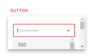
But I am hoping that the drop-down list is not restricted within the Menu itself but it can overflow out of it. Here is my code.
import { useState } from "react";
import { Button, Menu, Box,  } from "@mui/material";
import TextField from "@mui/material/TextField";
import Autocomplete from "@mui/material/Autocomplete";

const FilterMenuWithAutocomplete = () => {
  const [anchorEl, setAnchorEl] = useState<null | HTMLElement>(null);
  const open = Boolean(anchorEl);
  const handleButtonClick = (event: React.MouseEvent<HTMLButtonElement>) => {
    setAnchorEl(event.currentTarget);
  };
  const handleMenuClose = () => {
    setAnchorEl(null);
  };

  return (
    <>
      <Button
        id="filter-button"
        aria-controls={open ? "basic-menu" : undefined}
        aria-haspopup="true"
        aria-expanded={open ? "true" : undefined}
        disableRipple
        onClick={handleButtonClick}
      >
        Button
      </Button>
      <Menu
        id="price-filter-menu"
        anchorEl={anchorEl}
        open={open}
        onClose={handleMenuClose}
        MenuListProps={{
          "aria-labelledby": "price-filter-menu",
        }}
      >
          <Box sx={{ display: "flex", flexDirection: "row", p: 2  }}>
            <Autocomplete
              disablePortal
              id="autocomplete"
              options={option}
              sx={{ width: "200px" }}
              renderInput={(params) => (
                <TextField
                  {...params}
                  InputLabelProps={{ children: null }}
                  placeholder="Placeholder"
                  sx={{
                    '& input': {
                      height: "10px",
                      fontSize: '0.8rem',
                    },
                  }}
                />
              )}
            />
          </Box>
      </Menu>
    </>
  );
};

const option = [
  { label: "500", value: 500 },
  { label: "1000", value: 1000 },
  { label: "1500", value: 1500 },
  { label: "2000", value: 2000 },
  { label: "2500", value: 2500 },
  { label: "3000", value: 3000 },
  { label: "3500", value: 3500 },
  { label: "4000", value: 4000 },
  { label: "4500", value: 4500 },
  { label: "5000", value: 5000 },
  { label: "6000", value: 6000 },
  { label: "6000", value: 6000 },
  { label: "7000", value: 7000 },
  { label: "8000", value: 8000 },
  { label: "9000", value: 9000 },
  { label: "10,000", value: 10000 },
  { label: "12,000", value: 12000 },
  { label: "15,000", value: 15000 },
  { label: "20,000", value: 20000 },
  { label: "30,000", value: 30000 },
  { label: "40,000", value: 40000 },
  { label: "50,000", value: 50000 },
];

export default FilterMenuWithAutocomplete;
I tried creating a popper with the highest zIndex as below
const PopperMy = function (props) {
  return (<Popper {...props} style={{ width: 250, zIndex: 999999 }} placement='bottom-start' />)
}
<Autocomplete PopperComponent={PopperMy}>
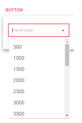
and also tried anchoring PopperComponent to the Menu instead but then not visible at all. I am hoping the result looks like this instead
Here is the codesandbox link: https://codesandbox.io/p/sandbox/autocompletemenu-fnfs63?file=%2Fsrc%2FApp.tsx
Solution
MUI uses its "portal" feature to render the Autocomplete's popover on top of everything else. Since you're passing disablePortal, it disables that feature and instead renders the popover inline, which makes it subject to the clipping, etc. of its parent.
Try removing disablePortal.
Answered By - Josh Kelley


0 comments:
Post a Comment
Note: Only a member of this blog may post a comment.