
Issue
I have code to vertically align table data at a set width:
.table-striped tbody tr:nth-child(odd) {
  background-color: #E7E9EB;
}

table {
  table-layout: fixed;
}

table thead th {
  text-align: left;
}

@media screen and (max-width: 600px) {
  table thead th {
    display: none;
  }

  table td {
    display: block;
  }

  table td::before {
    content: attr(data-label);
    font-weight: bold;
    margin-right:10px;
  }
}
<!-- This is a minimally styled version of the code found here https://whatabouthtml.com/ui-component/responsive-table-with-vertically-stacked-cells/ -->
<html>
<table width="100%" class="table-striped">
<thead>
<tr>
<th>Name</th>
<th>Document</th>
<th>Type</th>
<th>Color</th>
</tr>
</thead>
<tbody>
<tr>
<td data-label="Name">Jay</td>
<td data-label="Document">Handsome</td>
<td data-label="Type">Dog</td>
<td data-label="Color">Black</td>
</tr>
<tr>
<td data-label="Name">Carl</td>
<td data-label="Document">Friendly</td>
<td data-label="Type">Cat</td>
<td data-label="Color">Orange</td>
</tr>
<tr>
<td data-label="Name">Hissy</td>
<td data-label="Document">Eats well</td>
<td data-label="Type">Snake</td>
<td data-label="Color">Green</td>
</tr>
</tbody>
</table>
</html>The table goes from this:
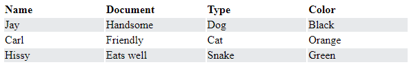
to this when browser width is decreased:
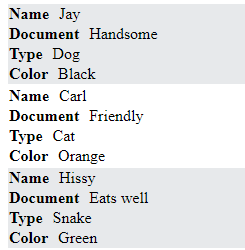
However, instead I want the table data cells to be aligned vertically like so:
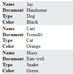
I want to just modify the code I have because this code is simpler to manage than the solution I had before.
How can this code be modified to achieve the vertical table data alignment?
Solution
I'm not sure you can dynamically fit the text in the first column, but I'd think a percentage width would do fine with a min-width for safety.
.table-striped tbody tr:nth-child(odd) {
  background-color: #E7E9EB;
}

table {
  table-layout: fixed;
}

table thead th {
  text-align: left;
}

@media screen and (max-width: 600px) {
  table thead th {
    display: none;
  }

  table td {
    display: block;
  }

  table td::before {
    content: attr(data-label);
    font-weight: bold;
    margin-right:10px;
    display: inline-block; /*******************************/
    width: 25%; /******************************************/
    min-width: 100px; /************************************/
  }
}
<!-- This is a minimally styled version of the code found here https://whatabouthtml.com/ui-component/responsive-table-with-vertically-stacked-cells/ -->
<html>
<table width="100%" class="table-striped">
<thead>
<tr>
<th>Name</th>
<th>Document</th>
<th>Type</th>
<th>Color</th>
</tr>
</thead>
<tbody>
<tr>
<td data-label="Name">Jay</td>
<td data-label="Document">Handsome</td>
<td data-label="Type">Dog</td>
<td data-label="Color">Black</td>
</tr>
<tr>
<td data-label="Name">Carl</td>
<td data-label="Document">Friendly</td>
<td data-label="Type">Cat</td>
<td data-label="Color">Orange</td>
</tr>
<tr>
<td data-label="Name">Hissy</td>
<td data-label="Document">Eats well</td>
<td data-label="Type">Snake</td>
<td data-label="Color">Green</td>
</tr>
</tbody>
</table>
</html>Answered By - isherwood


0 comments:
Post a Comment
Note: Only a member of this blog may post a comment.