
Issue
I'm trying to make a standalone dialog for my Angular app that can be used throughout the application. The dialog appears like it should, but no styling is being applied. The dialog code is:
@Component({
  standalone: true,
  selector: 'app-confirmation-dialog',
  templateUrl: './confirmation-dialog.component.html',
  styleUrls: ['./confirmation-dialog.component.scss'],
  imports: [
    CommonModule,
    MatDialogModule,
    MatButtonModule
  ]
})
And the template code is:
<h4 mat-dialog-title>Confirm</h4>
<div mat-dialog-content>
    {{message}}
</div>
<div mat-dialog-actions>
    <button (click)="yes()" color="primary">Yes</button>
    <button (click)="no()" color="alert">No</button>
    <button (click)="cancel()" color="warn" *ngIf="showCancel">Cancel</button>
</div>
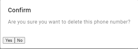
The resulting dialog looks like this:
What am I doing wrong here?
Solution
To use one of the Angular Material pre-built themes (the easiest solution by far), refer to Using a pre-built theme. Also make sure to select the correct Angular Material version in the toolbar.
Your styles array in angular.json should look like this:
"styles": [
  "@angular/material/prebuilt-themes/indigo-pink.css",
  "src/styles.scss"
],
By the way, this code can be inserted automatically with ng add @angular/material, which prompts you about theming, typography and animations.
Also, I see that you forgot to add mat-button to your button elements.
Here is a revised template:
<h4 mat-dialog-title>Confirm</h4>
<div mat-dialog-content>
    {{message}}
</div>
<div mat-dialog-actions>
    <button mat-button (click)="yes()" color="primary">Yes</button>
    <button mat-button (click)="no()" color="alert">No</button>
    <button mat-button (click)="cancel()" color="warn" *ngIf="showCancel">Cancel</button>
</div>
Answered By - John


0 comments:
Post a Comment
Note: Only a member of this blog may post a comment.