
Issue
Using a framework (materialize-css) it suggests me to put the following inside '$( document ).ready(function(){})' to get the responsive collapsible menu working:
$(".button-collapse").sideNav();
How would I do this in angular? I know that ngAfterContentInit is similar to '$( document ).ready(function(){})':
ngAfterContentInit(): void {
    //What do I put here?
  }
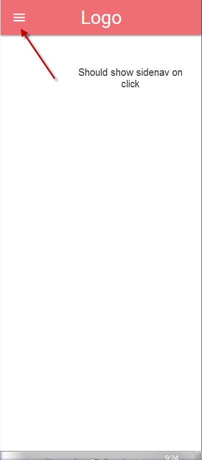
Below you can see a screenshot which shows the hamburger icon (that becomes visible only on mobile screen sizes):
Here's my html (app.component.html):
<nav>
  <div class="nav-wrapper">
    <a href="#!" class="brand-logo">Logo</a>
    <a href="#" data-activates="mobile-demo" class="button-collapse"><i class="material-icons">menu</i></a>
    <ul class="right hide-on-med-and-down">
      <li><a href="sass.html">Sass</a></li>
      <li><a href="badges.html">Components</a></li>
      <li><a href="collapsible.html">Javascript</a></li>
      <li><a href="mobile.html">Mobile</a></li>
    </ul>
    <ul class="side-nav" id="mobile-demo">
      <li><a href="sass.html">Sass</a></li>
      <li><a href="badges.html">Components</a></li>
      <li><a href="collapsible.html">Javascript</a></li>
      <li><a href="mobile.html">Mobile</a></li>
    </ul>
  </div>
</nav>
Solution
After some more research and trying out alternative tags on stackoverflow , I've found the perfect answer!
I have to make sure jquery is installed and angular-cli.json has the jquery node-module reference included at the very start !!
In my app.component.ts i had only to declare '$' as any.
Link to the answer: https://stackoverflow.com/a/42295505/7018180
Answered By - Jan Somers JanS91


0 comments:
Post a Comment
Note: Only a member of this blog may post a comment.