
Issue
I have group of toggle buttons. They are very light and disappear in the background on poor monitors with a high brightness level.
How can I properly style them? I would prefer to assign them the accent or primary colors, the way you can do it for regular buttons.
In may case, the primary and accent colors are dark. So they text should become white (with some transparency). For regular buttons, it automatically works.
<div class="output-size">
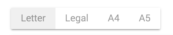
<mat-button-toggle-group>
<mat-button-toggle value="letter">Letter</mat-button-toggle>
<mat-button-toggle value="legal">Legal</mat-button-toggle>
<mat-button-toggle value="a4">A4</mat-button-toggle>
<mat-button-toggle value="a5">A5</mat-button-toggle>
</mat-button-toggle-group>
</div>
Solution
matButtonToggle does not support the color property like matButton.
You can use the css classes .mat-button-toggle and .mat-button-toggle-checked to style the different states.
With material theming you can extract whichever individual palettes you need from the theme and apply the backgrounds default-contrast color to the text color to achieve optimal contrast with light or dark colors.
Here is a Stackblitz with your mat-button-toggle-group example: Stackblitz
angular-t1k1x6
Theming used:
@import '~@angular/material/theming';

@include mat-core();

$app-primary: mat-palette($mat-indigo);
$app-accent:  mat-palette($mat-pink, A200, A100, A400);

$app-theme: mat-light-theme($app-primary, $app-accent);

@mixin mix-app-theme($app-theme) {
  $primary: map-get($app-theme, primary);
  $accent: map-get($app-theme, accent);

  .mat-button-toggle {
    background-color: mat-color($primary);
    color: mat-color($primary, default-contrast);
  }

  .mat-button-toggle-checked {
    background-color: mat-color($accent);
    color: mat-color($accent, default-contrast);
  }
}

// Include the mixin
@include mix-app-theme($app-theme);
Documents: Theming your Angular Material app
Answered By - Sashel Niles Gruber
0 comments:
Post a Comment
Note: Only a member of this blog may post a comment.