
Issue
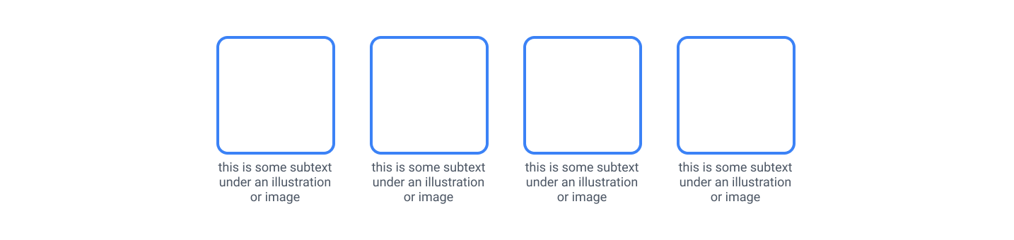
I'm struggling trying to replicate this using Flexbox. My result looks like this for the moment.
Here is the affected code :
<div class="box-container">
        <div class="box">
          <p>this is some subtext under an illustration or image</p>
        </div>
        <div class="box">
          <p>this is some subtext under an illustration or image</p>
        </div>
        <div class="box">
          <p>this is some subtext under an illustration or image</p>
        </div>
        <div class="box">
          <p>this is some subtext under an illustration or image</p>
        </div>
      </div>
.box-container {
  display: flex;
  justify-content: center;
  gap: 25px;
}

.box {
  height: 160px;
  width: 155px;
  border: 3px solid #3882f6;
  border-radius: 10px;
}
I just can't seem to figure out how to properly align/position the text under my boxes.
I already tried not nesting the box class with the paragraph but then the text is just hanging next to the box and not under it. I tried to play with margin and width of the container but without success.
Solution
.box-container {
  display: flex;
  justify-content: center;
  gap: 25px;
}

.box {
  height: 160px;
  width: auto;
  border: 3px solid #3882f6;
  border-radius: 10px;
}

.wrapper {
  display: flex;
  flex-direction: column;
  text-align: center;
}
<div class="box-container">
<div class="wrapper">
<div class="box">
</div>
<p>this is some subtext under an illustration or image</p>
</div>
<div class="wrapper">
<div class="box">
</div>
<p>this is some subtext under an illustration or image</p>
</div>
<div class="wrapper">
<div class="box">
</div>
<p>this is some subtext under an illustration or image</p>
</div>
<div class="wrapper">
<div class="box">
</div>
<p>this is some subtext under an illustration or image</p>
</div>
</div>You need to add a parent element for both elements and then just center the text and let the child take 100% of his parent width I believe this solves the issue
Answered By - Mbistami


0 comments:
Post a Comment
Note: Only a member of this blog may post a comment.