
Issue
I wanted to make two divs to be equal in height , yes from various forums and blogs i found the way of doing that. Though i made it work still these CSS rules(mentioned in query part) are bothering me and doesn't seems to be understandable. here's the mark up:-
<div class="container">
    <div class="left-col">
        Hello there , This is Left content<br/>
        Hello there , This is Left content<br/>
    <div>

    <div class="right-col">
        Hello there , This is right content<br/>
        Hello there , This is right content<br/>
        Hello there , This is right content<br/>
        Hello there , This is right content<br/>
    </div>
</div>
And here's the CSS :-
.container{
height:100%;
overflow:hidden;
}

.left-col{
width:50%;
float:left;
padding-bottom:500em;
margin-bottom:-500em;
}

.right-col{
width:50%;
float:left;
padding-bottom:500em;
margin-bottom:-500em;
}
Query- Can somebody explain the working of
padding-bottom:500em (or something)
&
margin-bottom:-500em(Use of negative sign).
Solution
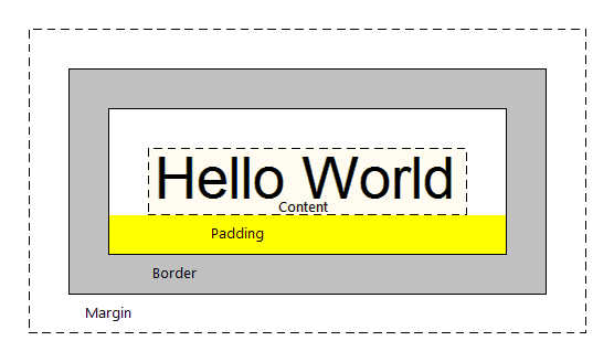
The padding-bottom property specifies the width between the element's content and the bottom border, represented by the yellow highlighted area in the illustration below.
Default value is 0, It can be defined in percentage, pixel, pt or em.
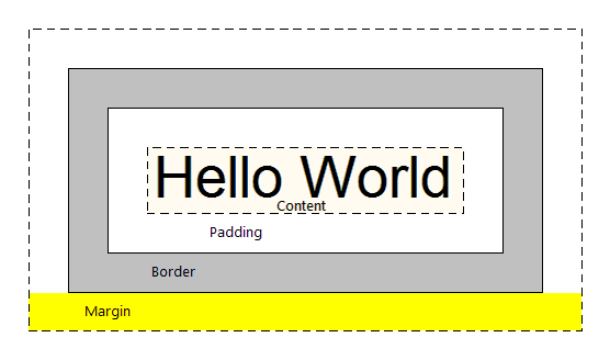
The margin-bottom property specifies the width between the element's bottom border and the element's outer edge, represented by the yellow highlighted area in the illustration below
The definitions for units are:
“Ems” (em): The “em” is a scalable unit that is used in web document media. An em is equal to the current font-size, for instance, if the font-size of the document is 12pt, 1em is equal to 12pt. Ems are scalable in nature, so 2em would equal 24pt, .5em would equal 6pt, etc. Ems are becoming increasingly popular in web documents due to scalability and their mobile-device-friendly nature.
Pixels (px): Pixels are fixed-size units that are used in screen media (i.e. to be read on the computer screen). One pixel is equal to one dot on the computer screen (the smallest division of your screen’s resolution). Many web designers use pixel units in web documents in order to produce a pixel-perfect representation of their site as it is rendered in the browser. One problem with the pixel unit is that it does not scale upward for visually-impaired readers or downward to fit mobile devices.
Points (pt): Points are traditionally used in print media (anything that is to be printed on paper, etc.). One point is equal to 1/72 of an inch. Points are much like pixels, in that they are fixed-size units and cannot scale in size.
Percent (%): The percent unit is much like the “em” unit, save for a few fundamental differences. First and foremost, the current font-size is equal to 100% (i.e. 12pt = 100%). While using the percent unit, your text remains fully scalable for mobile devices and for accessibility.
Answered By - Ankit Kumar


0 comments:
Post a Comment
Note: Only a member of this blog may post a comment.