
Issue
I want to make like this:
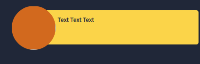
Here the circle is an image.
I tried this. But when I resize the window size the image circle gets shifted changes its postion. How can I fix that.
<div class="main">
    <img src=''>
    <div>Text Text Text</div>
</div>


.main {
        background-color: #fbd449;
        border-radius: 4.5px;
        padding: 0.5rem 3rem;
        position: relative;
        margin-left: 9rem;
}

img {
        position: absolute;
        background-color: chocolate;
        width: 9rem;
        height: 9rem;
        top: -12%;
        border-radius: 50%;
        left: -20%;
}
Also for smaller screen the div height increases but the image is of same height. If possible could you also help me in this problem too.
Solution
here is solution i think you are looking for..
if you use % then output will be different in mobile device.
in class .main and img you can change height and width as per your choice
.main {
  background-color: #fbd449;
  border-radius: 4.5px;
  padding: 0.5rem 3rem;
  position: fixed;
  margin-left: 9rem;
  top: 25px;
  left:-5px;
  height: 100px;
  width: auto;
  overflow: hidden;
}

img {
  position: fixed;
  background-color: chocolate;
  width: 9rem;
  height: 9rem;
  top: 12px;
  border-radius: 50%;
  left: 40px;
}
<div class="main">
<img src=''>
<div>Lorem ipsum dolor sit amet, consectetur adipisicing elit, sed do eiusmod tempor incididunt ut labore et dolore magna aliqua.</div>
</div>Answered By - Maulik


0 comments:
Post a Comment
Note: Only a member of this blog may post a comment.