
Issue
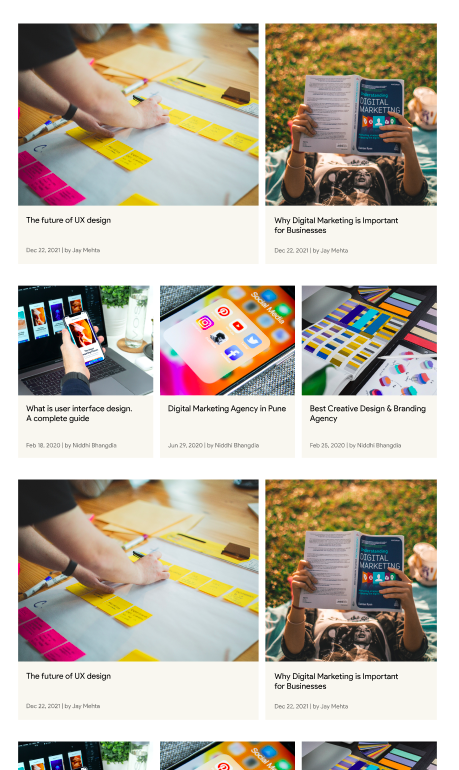
I am creating this layout using a grid container. This is for a blog list, which means more blogs (cards) can be added. There are 3 kinds of cards according to the design. (varying image sizes)
Method I have in my mind: Define separate classes for each card and span them accordingly and use grid-auto-flow as dense. Reference: auto-placement
Is there a better way to do this? I followed this document to understand about grids.
Solution
This should give you an idea to start with. Codepen: https://codepen.io/brandonzhang/pen/QWxaEPQ
<section class="grid">
  <div></div>
  <div></div>
  <div></div>
  <div></div>
  <div></div>
  <div></div>
  <div></div>
  <div></div>
  <div></div>
  <div></div>
  <div></div>
  <div></div>
</section>
body {
  margin: 0;
  background: #234;
}

.grid {
  display: grid;
  grid-template-columns: repeat(9, 1fr);
  grid-auto-rows: 100px;
  gap: 1rem;
}

div {
  background: lightseagreen;
  border-radius: 10px;
}

div:nth-child(5n+1) {
  grid-column: 1 / 6;
}

div:nth-child(5n+2) {
  grid-column: 6 / -1;
}

div:nth-child(5n+3),
div:nth-child(5n+4),
div:nth-child(5n+5)
{
  grid-column: span 3;
}
Answered By - Brandon Zhang


0 comments:
Post a Comment
Note: Only a member of this blog may post a comment.