
Issue
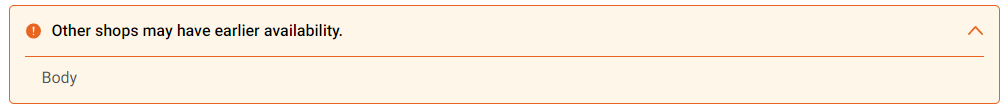
See the Chevrons in the attached images. The first one is from a desktop Chrome browser. It renders this way in the standard desktop browsers including Safari. It also renders this way in Chrome dev tools device simulations including iPhone 12, and on real Android devices.
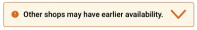
The second image shows how it renders on a real iPhone 12 and device simulations (such as lambdatest or browserstack). The Chevron is at least 100% larger.
I've tried adding a position: relative style to both the chevron and its parent div with no luck. Reference the answer by Aaron Krauss at Mobile Safari SVG Problem .
I don't know of a way to check the css from a simulation, let alone an iPhone. Any advice on how to do that or what to try for a fix?
Markup:
<div id="alert-message" class="warning" aria-live="assertive">
<div id="alert-message-header" data-bind="click: toggleAlertMessageBody()">
    <span id="alert-icon"></span>
    <span id="alert-header-text">Other shops may have earlier availability.</span>
    <button id="alert-chevron" name="alert-chevron-btn" type="button"></button>
</div>
<div id="alert-message-body" >Body</div>
css:
#alert-message {
margin-bottom: 32px;
border: 1px solid;
border-radius: 5px;
font-family: 'Roboto';
font-style: normal;
}
#alert-message #alert-message-header {
display: -webkit-box;
display: -ms-flexbox;
display: flex;
padding: 12px 16px 12px 16px;
min-height: 41px;
font-weight: 500;
cursor: pointer;
line-height: 26px;
position: relative;
}
#alert-message #alert-message-body {
margin: 0 15px;
padding: 8px 16px 12px 16px;
border-top: 1px solid;
color: #525656;
line-height: 26px;
font-weight: 400;
}
#alert-message.warning,
#alert-message.warning-info {
background-color: #fef6e8;
border-color: #e86421;
}
#alert-message.warning #alert-message-body,
#alert-message.warning-info #alert-message-body {
border-color: #e86421;
}
#alert-message.warning #alert-icon {
background: url("/Shared/images/alert-circle-yellow.svg") no-repeat;
min-width: 15px;
max-height: 25px;
background-position: center;
background-size: 100% auto;
}
#alert-message #alert-header-text {
padding: 0 10px;
color: #000000;
-webkit-box-flex: 1;
    -ms-flex-positive: 1;
        flex-grow: 1;
}
#alert-message.warning #alert-chevron {
background: url("/Shared/images/chevron-up-yellow.svg") no-repeat;
min-width: 15px;
max-height: 25px;
background-position: center;
background-size: 100% auto;
}
#alert-message #alert-chevron {
position: relative;
border: none;
transition: -webkit-transform 0.3s;
transition: transform 0.3s;
}
#alert-message #alert-chevron.collapsed {
-webkit-transform: rotate(180deg);
    -ms-transform: rotate(180deg);
        transform: rotate(180deg);
}
#alert-message b {
color: #000000;
}
Tried replacing the min-height on #alert-message-header div that contains the chevron with height: 48px;. No change.
SVG:
<svg xmlns="http://www.w3.org/2000/svg" width="15" height="9" viewBox="0 0 15 9">
<path fill="#E86421" fill-rule="nonzero" d="M7.5 0a.806.806 0 0 0-.593.265L.246 7.455a.957.957 0 0 0 0 1.28.796.796 0 0 0 1.185 0l6.07-6.55 6.068 6.55a.796.796 0 0 0 1.186 0 .957.957 0 0 0 0-1.28L8.093.265A.806.806 0 0 0 7.5 0"/>
</svg>
Solution
I don't know the "why" but removing the background-size: 100% auto; from the chevron (and keeping it for the alert-icon) fixed the issue.
Answered By - 333Matt


0 comments:
Post a Comment
Note: Only a member of this blog may post a comment.