
Issue
How would I go about implementing the onclick animation seen on this Google login form?
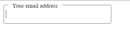
As you click the button box, the placeholder text shrinks and moves to the top left and the button border forms around the text.
Solution
With pure CSS I would approach it like that:
<style>
    input:focus ~ .floating-label,
    input:not(:focus):valid ~ .floating-label{
        top: -6px;
        left: 0.5rem;
        padding: 0.5rem;
        font-size: 11px;
        opacity: 1;
    }

    .inputText {
        font-size: 14px;
        width: 200px;
        height: 35px;
        outline: 1px!important;
    }

    .floating-label {
        position: absolute;
        pointer-events: none;
        left: 1rem;
        transform: translateY(-50%);
        top: 50%;
        background: white;
        transition: 0.2s ease all;
    }

</style>

<div style="position:relative; display:inline;">
    <input type="text" class="inputText" required/>
    <span class="floating-label">Your email address</span>
  </div>
Answered By - kumorin


0 comments:
Post a Comment
Note: Only a member of this blog may post a comment.