
Issue
I am working on angular application in which I am making a progress bar. My code is as follows:
CSS:
.progressbar {
      height: 56px;
      background: lightgray;
      box-shadow: inset 0px -2px 5px rgba(0, 0, 0, 0.5);
      animation: change 1s linear infinite;
      margin: 5px -10px;
      clip-path: polygon(95% 0%, 100% 50%, 95% 100%, 0% 100%, 5% 50%, 0% 0%);
    }
    .progressbar:first-child {
      margin-left: 0;
      clip-path: polygon(0% 0%, 95% 0%, 100% 50%, 95% 100%, 0% 100%);
    }
    .progressbar:last-child {
      margin-right:0;
    }
    .bar {
      display:flex;
      gap:20px; /*You can use now this property to play with the separation between the bars*/
    }
    .progressbar.active{
      background:
    linear-gradient(to right, red 0%, yellow 50%, green 34%)
      left/var(--p, 100%) fixed,
    lightgray;
      box-shadow: inset 0px -2px 5px rgba(0, 0, 0, 0.5);
    }
HTML:
<div class="bar">
    <div class="progressbar active" style="width:100%;"></div>
    <div class="progressbar" style="width:100%;"></div>
    <div class="progressbar" style="width:100%;"></div>
</div>
With this I am getting a progress bar like this 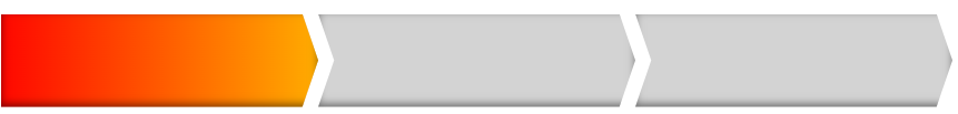 . This is very near to my desired result. But with this code arrow shape of bars is not proper. The shape of arrow I want is
  . How can I change shape of my bars exactly as same that of required as shown in image.
Solution
- Add negative right margin to your tabs (+ the desired gap size)
- Add a positive margin-right to the parent wrapper (of the same size)
Easily achievable with just two CSS variables --d and --gap. Edit their values to achieve the desired result:
/*Quick Reset*/
* { margin: 0; box-sizing: border-box; }

body {
  font: 1rem/1.3 sans-serif;
}

/*
 * Progressbar
 */

.bar {
  --d: 1rem;       /* arrow depth */
  --gap: 0.3rem;   /* arrow thickness, gap */

  display: flex;
  margin-right: var(--d);
}

.bar-step {
  flex: 1;
  display: flex;
  justify-content: center;
  align-items: center;
  text-align: center;
  padding: 0.6rem var(--d);
  margin-right: calc(var(--d) * -1 + var(--gap));
  background: #d9e3f7;
  color: #23468c;
  clip-path: polygon(
    0% 0%,
    calc(100% - var(--d)) 0%,
    100% 50%,
    calc(100% - var(--d)) 100%,
    0% 100%,
    var(--d) 50%
  );
}

.bar-step:first-child {
  clip-path: polygon(
    0% 0%,
    calc(100% - var(--d)) 0%,
    100% 50%,
    calc(100% - var(--d)) 100%,
    0% 100%
  );
}


.bar-step.active {
  background: #23468c;
  color: #fff;
}
<div class="bar">
<div class="bar-step active">Step 1</div>
<div class="bar-step">Step 2 text</div>
<div class="bar-step">Step 3</div>
<div class="bar-step">Step 4</div>
</div>Answered By - Roko C. Buljan


0 comments:
Post a Comment
Note: Only a member of this blog may post a comment.