
Issue
I'm trying to create a border like the image
I tried to do it using clip-path but without success to get something that is the same
clip-path: polygon(0% 15%, 0 0, 15% 0%, 85% 0%, 100% 0, 100% 15%, 100% 90%, 96% 91%, 91% 100%, 9% 100%, 4% 92%, 0 91%);
How can I make a border like the one in the image?
Solution
First, draw the vector shape with the custom corners you want. I'm using Inkscape:
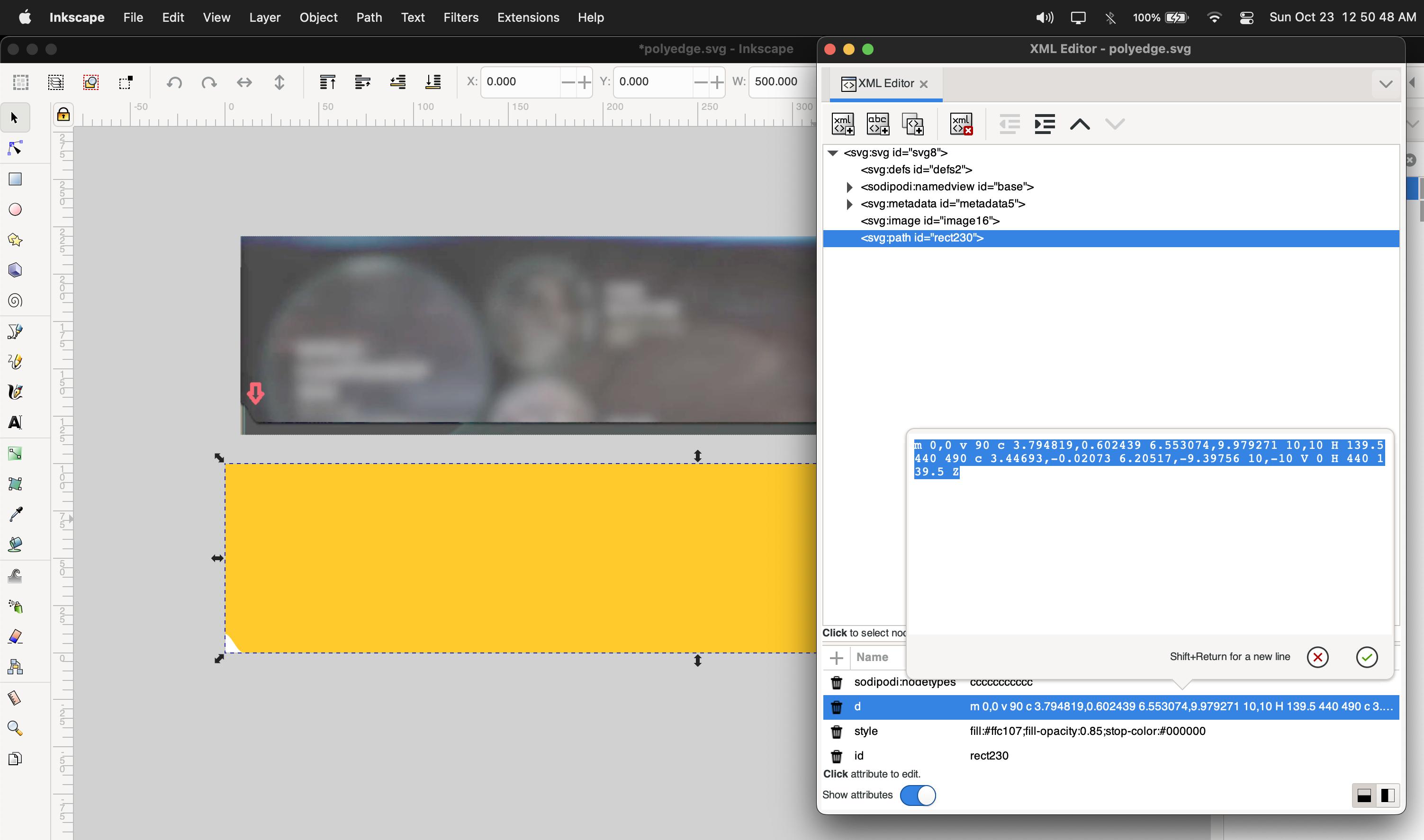
Then, add it as a clip-path path
.onlyForTheShadow {
  filter: drop-shadow(0 3px 0 black);
}

.customBorder {
  width: 500px;
  height: 100px;
  background: orange;
  clip-path: path('m 0,0 v 90 c 3.8,0.6 6.55,10 10,10 H 139.5 440 490 c 3.45,-0 6.2,-9.4 10,-10 V 0 H 440 139.5 Z');
}
<div class="onlyForTheShadow">
<div class="customBorder"></div>
</div>When drawing the image, make sure the path doesn't have a transform. If it does, try to ungroup it or, pop it out of a layer.
Answered By - Eric Fortis


0 comments:
Post a Comment
Note: Only a member of this blog may post a comment.