
Issue
I'm stuck on a Flexbox use case:
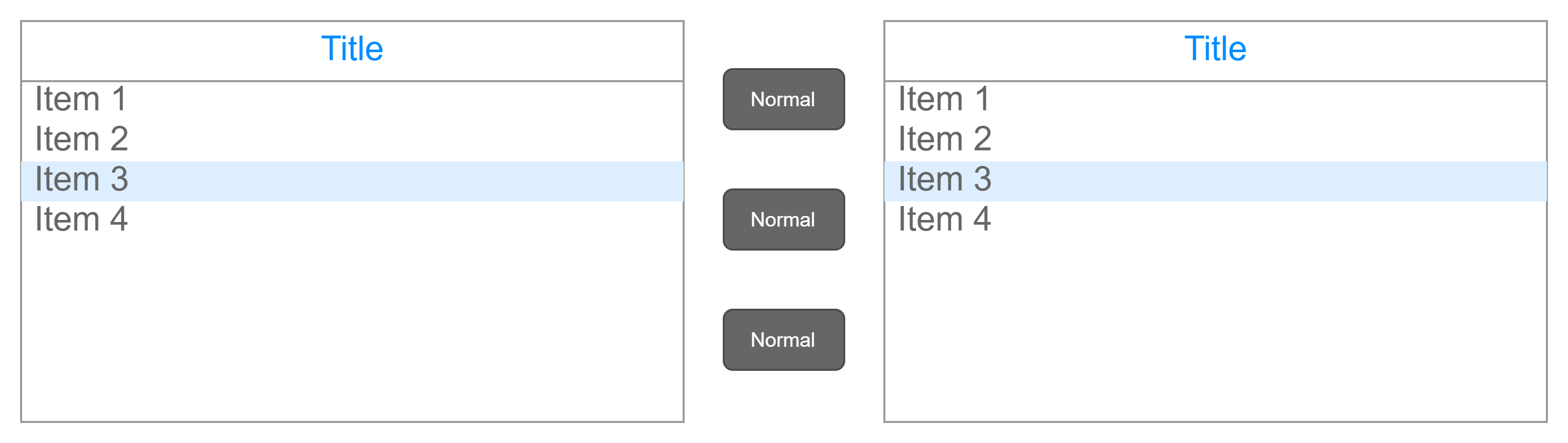
I have a horizontal layout for 2 grids with a central (fixed-width ) commands column which allows user to get left grid elements in the right one. See the following scheme:
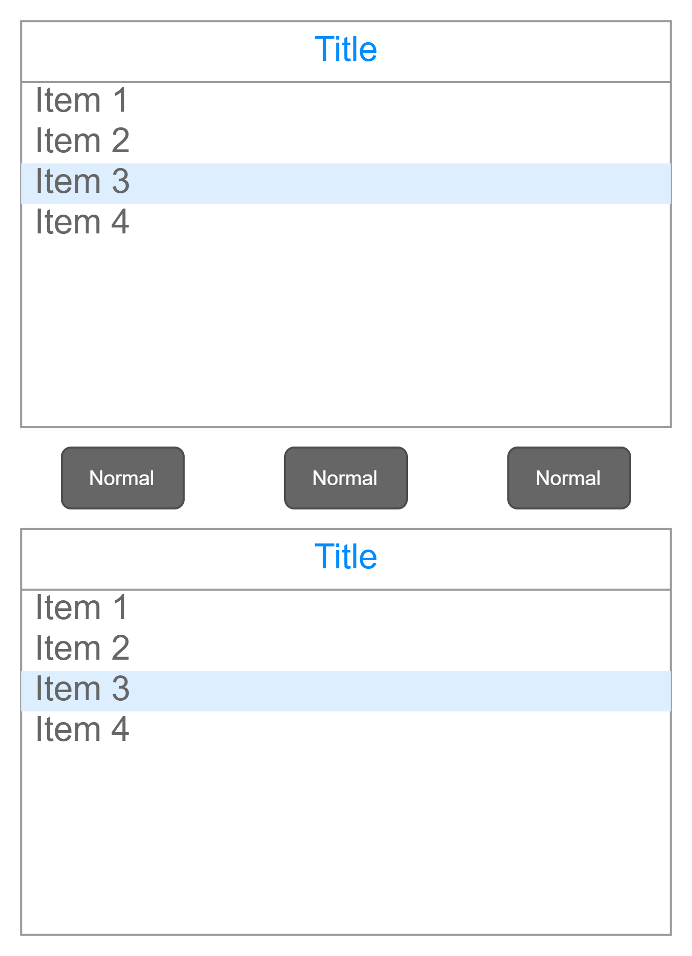
On a smaller screen, I would like to horizontalize those buttons and not to waste vertical space. See the following scheme:
Anyone would have an idea on how to manage this?
Solution
You can simply use flexbox with either the column or row direction, based on the screen width. Use a media query to switch between both views:
.box {
  display: flex;
  flex-direction: column;
  text-align: center;
}

.box div {
  border: 1px solid #ddd;
}

button {
  width: 100px;
}

@media screen and (min-width: 800px) {
 .box {
    flex-direction: row;
  }

  .box :nth-child(1),
  .box :nth-child(3) {
    flex: 1;
  }

  .box :nth-child(2) {
    flex: 0 1 100px;
   }
 }
<div class="box">
<div>1</div>
<div>
<button type="button">A</button>
<button type="button">B</button>
<button type="button">C</button>
</div>
<div>3</div>
</div>Answered By - insertusernamehere


0 comments:
Post a Comment
Note: Only a member of this blog may post a comment.