
Issue
I'm moving my first steps into HTML and CSS after completing an online course. As an attempt to strengthen the basics I've learned so far, I'm trying to replicate simple existing websites. These days I'm trying to replicate the homepage of flickr.com .
Basically I can't get the central part of my page (the one with the "Find your inspiration." sentence and the "Start for free" button) to stay centered whenever I zoom in and out. Apparently I can't get the <body> content to responsively fill the space between the <header> and the <footer>.
I've already spent my fair amount of hours googling around, playing with heights, flex and trying to reshape the layout of my page but I can't figure out how to reproduce the desired effect yet. I'm sure I'm messing up with the layout (especially with the nesting of my containers) but I really can't spot my mistake.
If you have the patience to give my code a look I'd really appreciate that. Thank you very much.
My index.html:
<html>

<head>
</head>

<body>
    <header>
        ...
    </header>

    <main>
        <div class="wrapper">
            <h1>Find your inspiration.</h1>
            <h2>Join the Flickr community, home to tens
            of billions of photos and 2 million
            groups.</h2>

            <div class="start-button">
                <a href="#">Start for free</a>
            </div>
        </div>
    </main>

    <footer>
    </footer>

</body>
</html>
My style.css file
html {
    background: url(images/8225606733_086c8f3d83_o.jpg)no-
    repeat center center fixed;
    -webkit-background-size: cover;
    -moz-background-size: cover;
    -o-background-size: cover;
    background-size: cover;
    height: 100%;
}

header {
    min-height: 70px;
    display: flex;
    align-items: center;
    justify-content: space-between;
    padding: 0px 20px;
}

main {
    min-height: 400px;
    width: 100%;
    display: flex;
    justify-content: center;
    align-items: center;
}

.wrapper {
    display: block;
    text-align: center;
    color: white;
    font-family: Arial, Helvetica, sans-serif;
    padding: 0 30px;
}


.wrapper h1 {
    font-size: 40px;
    font-weight: bold;
    margin-bottom: 18px;
}

.wrapper h2 {
    font-size: 25px;
    font-weight: normal;
    margin-bottom: 50px;
}

.wrapper a {
    color: black;
    font-weight: bold;
    background-color: white;
    padding: 12px 23px;
    border-radius: 3px;
}


footer {
    position: fixed;
    width: 100%;
    bottom: 0px;
}
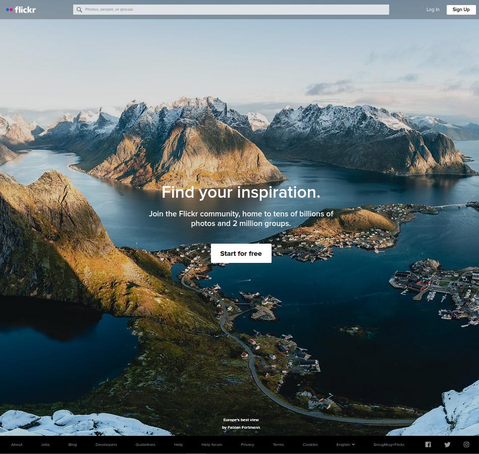
Here are both the screenshot of the real flickr.com home page and the screenshot of the clone page I'm trying to build. As you can see, my page doesn't keep the element centered when I zoom out because my block doesn't stretch to fill the space between <header> and <footer> :
My clone home page
Original Flickr home page
Solution
try this way:
main {
    height: calc(100vh - 70px);
    width: 100%;
    display: flex;
    justify-content: center;
    align-items: center;
}
You can't center the .wrapper element because you assigned a min-height: 400px to its parent element so it doesn't span for the entire viewport height. Try adding a colored background to the main element and you'll see.
Answered By - John Shot


0 comments:
Post a Comment
Note: Only a member of this blog may post a comment.