
Issue
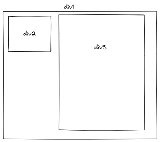
I have two divs, side by side, where one (right) has more content that the other (left). I've been trying to have the left one, horizontally align with the right one, so they both can be on one line. Like the drawing below.
Here is my code:
.allinside {
  display: flex;
  vertical-align: top;
}

.profile_part {
  background-color: #a7f996;
  border-radius: 25px;
  width: 18%;
  margin: 0 10px 0 10px;
  margin-right: auto;
}

.mid_part {
  background-color: #a7f996;
  border-radius: 25px;
  width: 70%;
  margin: 0 10px 0 10px;
  margin-left: auto;
}

.textinside {
  padding-bottom: 10px;
  text-align: center;
}
<div class="allinside">
<div class="profile_part">
<img id="mimi" src="img/profilepic.gif" alt="Maria" />
<p class="textinside">Maria's choices</p>
</div>
<div class="mid_part">
<h2>The last book I read:</h2>
<img src="img/bravenewworld.jpg" alt="Brave new world" />
<p class="textinside">SOME TEXT INSIDE</p>
<h2>My favourite book:</h2>
<img src="img/searchformeaning.jpg" alt="Man's search for meaning" />
<p class="textinside">SOME TEXT INSIDE</p>
</div>Solution
Getting to know the display types might help(inline, inline-block, block, flex)
Here, the flex at the parent is causing the elements to stretch.
Try inline-block
.allinside{
}

.profile_part{
    background-color: #a7f996;
    border-radius: 25px;
    width: 18%;
    margin: 0 10px 0 10px;
    margin-right: auto;
    vertical-align:top;
    display:inline-block;

}

.mid_part{
    background-color: #a7f996;
    border-radius: 25px;
    width: 70%;
    margin: 0 10px 0 10px;
    margin-left: auto;
    display:inline-block;

}


.textinside{
    padding-bottom: 10px;
    text-align: center;
}
Answered By - D.B.K


0 comments:
Post a Comment
Note: Only a member of this blog may post a comment.