
Issue
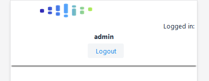
In the mobile version of my application, I have the following items for header layout. App logo, "logged in" text, username, and logout button. What I want is
- Logo should be on top left of the header
- Logged in: admin should appear on the same line and right aligned
- Under them , logout button should also be aligned to the right side.
I'm using vaadin and that allows me to write css, where I decided I could do this with flex display but I can't get it working, how could I achieve it?
My current css looks like this:
/* On screens that are 600px or less, set the background color to olive */
@media screen and (max-width: 600px) {
    .header-layout {
        display: flex;
        flex-direction: column;
    }
    .logo {
        flex: 1;
        align-self: flex-start;
    }
    .application-name {
        display: none
    }
    .admin-text {
        flex: 0 50%;
    }
    .user-name {
    flex: 0 50%;
    }
    .logout-button {
        flex: 0.5;
        margin-bottom: 20px;
    }
}
Solution
I would be using justify-content:
In the html wrap everything in a div called flex and then split the two areas in top and bottom:
<div class="flex">
  <div class="top">
    `Here insert the logo and logged in`
  </div>
  <div class="bottom">
    `Here insert logout button`
  </div>
</div>
Then, within the CSS:
.flex {
  display: flex;
  flex-direction: column;
}

.top {
  display: flex;
  justify-content: space-between;
}

.bottom {
  display: flex;
  justify-content: flex-end;
}
Answered By - Armando Guarino


0 comments:
Post a Comment
Note: Only a member of this blog may post a comment.