
Issue
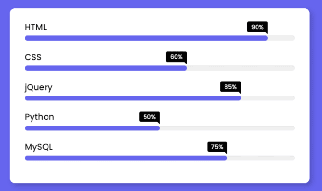
I have seen these progress bars on the internet, and I want the same ones in my cards for every "Detail", but I do not know how to implement it.
I just can't imagine how this can be packaged in ul. Maybe you know another way. If you know, I need your help with this.
Below I have attached the markup code of the card and the style.
*,
*::after,
*::before {
  margin: 0;
  padding: 0;
  box-sizing: border-box;
}

/* .flip-card-container */
.flip-card-container {
  --hue: 150;
  --primary: hsl(var(--hue), 50%, 50%);
  --white-1: hsl(0, 0%, 90%);
  --white-2: hsl(0, 0%, 80%);
  --dark: hsl(var(--hue), 25%, 10%);
  --grey: hsl(0, 0%, 50%);
  width: 310px;
  height: 500px;
  margin: 40px;
  perspective: 1000px;
}

/* .card-... */
.card-front{
  width: 100%;
  height: 100%;
  border-radius: 24px;
  background: var(--dark);
  position: absolute;
  top: 0;
  left: 0;
  overflow: hidden;
  backface-visibility: hidden;
  display: flex;
  justify-content: center;
  align-items: center;
}

/* ul */
ul {
  padding-top: 50%;
  margin: 0 auto;
  width: 70%;
  height: 100%;
  list-style: none;
  color: var(--white-1);
  display: flex;
  justify-content: center;
  align-items: center;
  flex-direction: column;
}

/* li */
li {
  width: 100%;
  margin-top: 12px;
  padding-bottom: 12px;

  font-size: 14px;
  text-align: center;

  position: relative;
}

li:nth-child(2n) {
  color: var(--white-2);
}

li:not(:last-child)::after {
  content: "";
  position: absolute;
  bottom: 0;
  left: 0;
  width: 100%;
  height: 1px;
  background: currentColor;
  opacity: .2;
}
<div class="flip-card-container" style="--hue: 220">
<div class="flip-card">
<div class="card-front">
<ul>
<li>Detail 1</li>
<li>Detail 2</li>
<li>Detail 3</li>
<li>Detail 4</li>
<li>Detail 5</li>
</ul>
</div>
</div>
</div>Please stop putting at the bottom of each of my topics at once :(
Solution
Not sure why the progress tag would look ugly on windows 7, you can style it like anything else - but knowing you didn't want to use it, you can just emulate it with a couple of divs and setting the width of the internal one to whatever your progress % is
definitely give styling the progress bar another chance though, plenty of guides online
*,
*::after,
*::before {
  margin: 0;
  padding: 0;
  box-sizing: border-box;
}


/* .flip-card-container */

.flip-card-container {
  --hue: 150;
  --primary: hsl(var(--hue), 50%, 50%);
  --white-1: hsl(0, 0%, 90%);
  --white-2: hsl(0, 0%, 80%);
  --dark: hsl(var(--hue), 25%, 10%);
  --grey: hsl(0, 0%, 50%);
  width: 310px;
  height: 500px;
  margin: 40px;
  perspective: 1000px;
}


/* .card-... */

.card-front {
  width: 100%;
  height: 100%;
  border-radius: 24px;
  background: var(--dark);
  position: absolute;
  top: 0;
  left: 0;
  overflow: hidden;
  backface-visibility: hidden;
  display: flex;
  justify-content: center;
  align-items: center;
}


/* ul */

ul {
  padding-top: 50%;
  margin: 0 auto;
  width: 70%;
  height: 100%;
  list-style: none;
  color: var(--white-1);
  display: flex;
  justify-content: center;
  align-items: center;
  flex-direction: column;
}


/* li */

li {
  width: 100%;
  margin-top: 12px;
  padding-bottom: 12px;
  font-size: 14px;
  text-align: center;
  position: relative;
}

li:nth-child(2n) {
  color: var(--white-2);
}

li:not(:last-child)::after {
  content: "";
  position: absolute;
  bottom: 0;
  left: 0;
  width: 100%;
  height: 1px;
  background: currentColor;
  opacity: .2;
}

.progress-bar {
  width: 100%;
  padding: 5px 5px;
  border-radius: 10px;
  background-color: #2a2a2a;
  margin-top: 10px;
}

.progress-bar .progress-inner {
  height: 5px;
  border-radius: 5px;
  background-color: #a57eef;
}

progress {
padding: 5px;
}
progress[value] {
  width: 100%;
  padding: 5px;
}
<div class="flip-card-container" style="--hue: 220">
<div class="flip-card">
<div class="card-front">
<ul>
<li>
Detail 1
<div class="progress-bar">
<div class="progress-inner" style="width: 47%;" />
</div>
</li>
<li>Detail 2
<div class="progress-bar">
<div class="progress-inner" style="width: 17%;" />
</div>
</li>
<li>Detail 3
<div class="progress-bar">
<div class="progress-inner" style="width: 69%;" />
</div>
</li>
<li>Detail 4
<div class="progress-bar">
<div class="progress-inner" style="width: 5%;" />
</div>
</li>
<li>Detail 5
<div class="progress-bar">
<div class="progress-inner" style="width: 95%;" />
</div>
</li>
</ul>
</div>
</div>
</div>Answered By - MapleDev


0 comments:
Post a Comment
Note: Only a member of this blog may post a comment.