
Issue
Hi i am using bootstrap select dropdown, but i want to make its appearance look like the below image, but no plugin's to be installed. i tried in these ways but didnt work. this new dropdown design must have same functionality as normal select dropdown does, like from binding dropdpown values to the select field and giving value of the selected dropdown.
HTML:
<div class="col-3 mb-3">
                <label for="exampleFormControlInput1" class="form-label">Project</label>
                <select class="form-select" aria-label="Default select example" >
                    <option selected value="">Select Project</option>
                    <option value="ACTIVE">Active</option>
                    <option value="Terminate">TERMINATED</option>
                  </select>
                 </div>
CSS:
select.form-select {
  -webkit-appearance: none;
  -moz-appearance: none;
  background: url("data:image/svg+xml;utf8,<svg version='1.1' xmlns='http://www.w3.org/2000/svg' xmlns:xlink='http://www.w3.org/1999/xlink' width='18' height='18' viewBox='0 0 24 24'><path fill='grey' d='M7.406 7.828l4.594 4.594 4.594-4.594 1.406 1.406-6 6-6-6z'></path></svg>") #fff;
  background-position: 98% 50%;
  background-repeat: no-repeat;
}
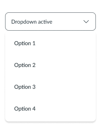
Need design like this:
Solution
Here you go...
Solution 1:
ngx-bootstrap
See the StackBlitz snippet here.
UPDATE
Solution 2:
ng-bootstrap
See the StackBlitz snippet here.
app.component.ts
import { Component } from '@angular/core';

@Component({
  selector: 'app-root',
  templateUrl: './app.component.html',
  styleUrls: ['./app.component.css'],
})
export class AppComponent {
  clickMessage = 'Choose an option';

  getText(text) {
    this.clickMessage = text;
  }
}
app.component.html
<body class="p-3">
  <div class="row">
    <div class="col">
      <div ngbDropdown class="d-inline-block">
        <button
          type="button"
          class="btn btn-outline-primary"
          id="dropdownBasic1"
          ngbDropdownToggle
        >
          {{ clickMessage }}
        </button>
        <div ngbDropdownMenu aria-labelledby="dropdownBasic1">
          <button
            ngbDropdownItem
            class="nav-link"
            href="#"
            (click)="getText($event.target.innerText)"
          >
            Option 1
          </button>
          <button
            ngbDropdownItem
            class="nav-link"
            href="#"
            (click)="getText($event.target.innerText)"
          >
            Option 2
          </button>
          <button
            ngbDropdownItem
            class="nav-link"
            href="#"
            (click)="getText($event.target.innerText)"
          >
            Option 3
          </button>
        </div>
      </div>
    </div>
  </div>
</body>
app.component.css
.btn {
  width: 200px;
  color: black;
  background-color: white;
  border: 1px solid black;
  border-radius: 10px;
}

button:focus,
button:active {
  color: black;
  background-color: white;
  border: 1px solid black;
  outline: none !important;
  box-shadow: none !important;
}

.dropdown-menu {
  width: 100%;
  border: none;
  box-shadow: 2px 5px 5px #dcdcdc;
  border-radius: 10px;
}

.nav-link {
  color: black;
}

.nav-link:hover,
.nav-link:focus {
  color: black;
  border: none;
}
Answered By - Cervus camelopardalis


0 comments:
Post a Comment
Note: Only a member of this blog may post a comment.