
Issue
How would I do the following layout in pure css.
3 columns with percentage based width, not px.
and a sticky header that is only in the middle column, not left/right.
When scrolling, over any! of the 3 column, only content in the middle column scrolls. Kind of how twitters layout is.
edit: this is what i got so far, the sticky header wont stick. when i scroll to the bottom, it "disappears" https://jsfiddle.net/pkrbc7dm/
html,body{height:100%}
.wrap{width:100%;height:100%;position:relative}
.left,.right{width:20%;top: 0; bottom: 0px;position: fixed;}
.left,.center,.right,.bodywrap{height:100%}
.center{margin:0 20%;}
.left{left:0}
.right{right:0}

.left{background-color:#aaa}
.right{background-color:#ccc}

.head2{
  background-color:tomato;
  width:100%;
  position:sticky;
  top:0;
}
<div class='wrap'>
<div class='left'>left</div>
<div class='right'>right</div>
<div class='center'>
<div class="head2">HEADER</div>
hello world, hello world, hello world, hello world, hello world,
hello world, hello world, hello world, hello world, hello world,
hello world, hello world, hello world, hello world, hello world,
hello world, hello world, hello world, hello world, hello world,
hello world, hello world, hello world, hello world, hello world,
hello world, hello world, hello world, hello world, hello world,
hello world, hello world, hello world, hello world, hello world,
hello world, hello world, hello world, hello world, hello world,
hello world, hello world, hello world, hello world, hello world,
hello world, hello world, hello world, hello world, hello world,
hello world, hello world, hello world, hello world, hello world,
hello world, hello world, hello world, hello world, hello world,
hello world, hello world, hello world, hello world, hello world,
hello world, hello world, hello world, hello world, hello world,
hello world, hello world, hello world, hello world, hello world,
hello world, hello world, hello world, hello world, hello world,
hello world, hello world, hello world, hello world, hello world,
hello world, hello world, hello world, hello world, hello world,
hello world, hello world, hello world, hello world, hello world,
hello world, hello world, hello world, hello world, hello world,
hello world, hello world, hello world, hello world, hello world,
hello world, hello world, hello world, hello world, hello world,
hello world, hello world, hello world, hello world, hello world,
hello world, hello world, hello world, hello world, hello world,
hello world, hello world, hello world, hello world, hello world,
hello world, hello world, hello world, hello world, hello world,
hello world, hello world, hello world, hello world, hello world,
hello world, hello world, hello world, hello world, hello world,
hello world, hello world, hello world, hello world, hello world,
hello world, hello world, hello world, hello world, hello world,
</div>
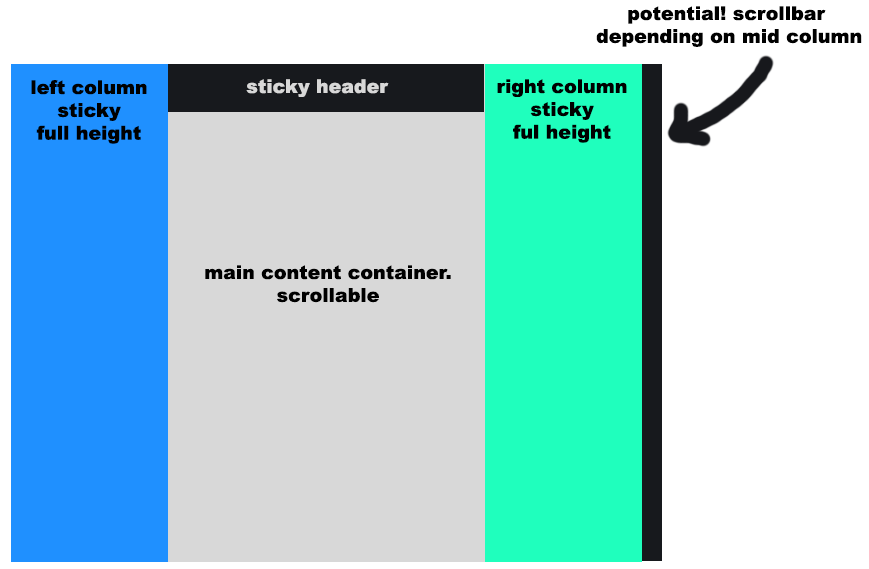
</div>see below picture for what i mean
thank you
Solution
Well, I believe this is what you asked. All parts using percentage based width, with the same layout, and only the main content scrolling.
body {
  margin: 0px;
}

.left-column {
  width: 25%;
  height: 100%;
  position: fixed;
  background-color: lightblue;
  top: 0;
}

.right-column {
  width: 25%;
  height: 100%;
  position: fixed;
  right: 0;
  top: 0;
  background-color: lightblue;
}

.main-content {
  margin: 0% 25%;
  width: 50%;
}

.topbar {
  background-color: black;
  width: 50%;
  height: 50px;
  position: fixed;
  z-index: 10;
}

.content {
  padding-top: 60px;
}

.content>img {
  width: 100%;
}
<div class="left-column"></div>
<div class="main-content">
<div class="topbar"></div>
<div class="content">
<img src="https://www.nicepng.com/png/full/862-8628237_random-image-from-user-minecraft-logo-coloring-pages.png">
<img src="https://www.nicepng.com/png/full/862-8628237_random-image-from-user-minecraft-logo-coloring-pages.png">
</div>
</div>
<div class="right-column"></div>Answered By - manjiro sano


0 comments:
Post a Comment
Note: Only a member of this blog may post a comment.