
Issue
If I have a radio group with buttons:
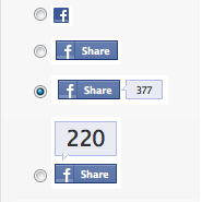
... how can I show only images in the select option instead of the buttons, e.g.
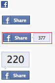
Solution
- Wrap radio and image in
<label> - Hide radio button (Don't use
display:noneorvisibility:hiddensince such will impact accessibility) - Target the image next to the hidden radio using Adjacent sibling selector
+
/* HIDE RADIO */
[type=radio] {
  position: absolute;
  opacity: 0;
  width: 0;
  height: 0;
}

/* IMAGE STYLES */
[type=radio] + img {
  cursor: pointer;
}

/* CHECKED STYLES */
[type=radio]:checked + img {
  outline: 2px solid #f00;
}
<label>
<input type="radio" name="test" value="small" checked>
<img src="https://via.placeholder.com/40x60/0bf/fff&text=A">
</label>
<label>
<input type="radio" name="test" value="big">
<img src="https://via.placeholder.com/40x60/b0f/fff&text=B">
</label>Don't forget to add a class to your labels and in CSS use that class instead.
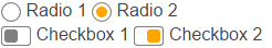
Custom styles and animations
Here's an advanced version using the <i> element and the :after pseudo:
body{color:#444;font:100%/1.4 sans-serif;}


/* CUSTOM RADIO & CHECKBOXES
   http://stackoverflow.com/a/17541916/383904 */
.rad,
.ckb{
  cursor: pointer;
  user-select: none;
  -webkit-user-select: none;
  -webkit-touch-callout: none;
}
.rad > input,
.ckb > input{ /* HIDE ORG RADIO & CHECKBOX */
  position: absolute;
  opacity: 0;
  width: 0;
  height: 0;
}
/* RADIO & CHECKBOX STYLES */
/* DEFAULT <i> STYLE */
.rad > i,
.ckb > i{
  display: inline-block;
  vertical-align: middle;
  width:  16px;
  height: 16px;
  border-radius: 50%;
  transition: 0.2s;
  box-shadow: inset 0 0 0 8px #fff;
  border: 1px solid gray;
  background: gray;
}
/* CHECKBOX OVERWRITE STYLES */
.ckb > i {
  width: 25px;
  border-radius: 3px;
}
.rad:hover > i{ /* HOVER <i> STYLE */
  box-shadow: inset 0 0 0 3px #fff;
  background: gray;
}
.rad > input:checked + i{ /* (RADIO CHECKED) <i> STYLE */
  box-shadow: inset 0 0 0 3px #fff;
  background: orange;
}
/* CHECKBOX */
.ckb > input + i:after{
  content: "";
  display: block;
  height: 12px;
  width:  12px;
  margin: 2px;
  border-radius: inherit;
  transition: inherit;
  background: gray;
}
.ckb > input:checked + i:after{ /* (RADIO CHECKED) <i> STYLE */
  margin-left: 11px;
  background:  orange;
}
<label class="rad">
<input type="radio" name="rad1" value="a">
<i></i> Radio 1
</label>
<label class="rad">
<input type="radio" name="rad1" value="b" checked>
<i></i> Radio 2
</label>
<br>
<label class="ckb">
<input type="checkbox" name="ckb1" value="a" checked>
<i></i> Checkbox 1
</label>
<label class="ckb">
<input type="checkbox" name="ckb2" value="b">
<i></i> Checkbox 2
</label>Answered By - Roko C. Buljan


0 comments:
Post a Comment
Note: Only a member of this blog may post a comment.