
Issue
I am in the process of adapting a pretty stunning looking bootstrap mega menu into a fully responsive version. I wish to keep the look and feel of the menu as it is very eye-catching however the menu currently makes use of Bootstrap's dropdown-menu functionality meaning the user must click to reveal the menu. In my eyes this is not a good user experience on the desktop as many will expect a menu to appear on hover. So, I have adapted the menu using the following code to ensure the child elements of the mega menu are shown when the user hovers over an element on the desktop:
@media only screen and (min-width: 992px){
    .mega-dropdown:hover .mega-dropdown-menu{
        display: block;
    }
}
This is great and achieves the desired effect of revealing the menu on hover on a desktop however when I move the mouse to select menu items, the menu disappears. I believe this is because of the gap that is present between the link that triggers the child menu and top of the child menu.
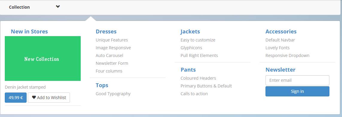
Is there any way in which I can cause the menu to stay open long enough for the user to move into the child menu using just HTML and CSS? I know I could easily use Javascript for this but in my eyes Javascript should be used sparingly and only when really necessary.
Full code can be found in this Codepen:
http://codepen.io/JasonEspin/pen/zGqoBa
Solution
You need to remove the top margin and replace it with something you can actually over over like a transparent border.
.navbar-nav>li>.dropdown-menu {
  margin-top: 0; /* remove applied top margin */
  border-top-left-radius: 4px;
  border-top-right-radius: 4px;
  border-top: 20px solid transparent;
}
Note: I've not tested this at other widths to you would have so test if this is what is required at all widths.
Answered By - Paulie_D


0 comments:
Post a Comment
Note: Only a member of this blog may post a comment.