
Issue
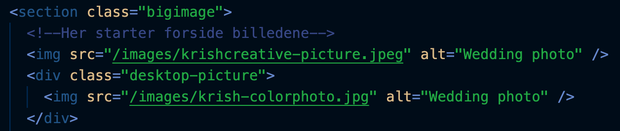
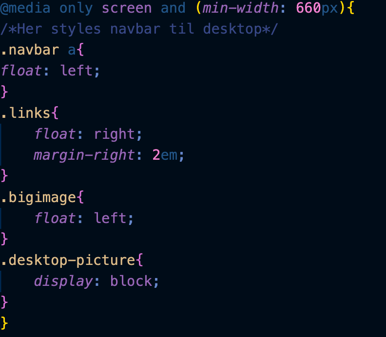
For mobile there should only be one image showing, but for desktop there should be two img next to each other. The two images are in one section but separated in their own div. Picture of HMTL section here with the images How do I show the second image on desktop and still place them next to each other. I have tried using float but then it cancels the display: block and the second image won't show. Picture of my CSS styling using @Media queries
Solution
Use grid (or flex box) to get the images side by side. If you want some space between the images use grid-gap (leve it out if you don´t want that). To hide the second image on mobile use display: none and then display: block on desktop.
Here is an example on how you can do this whit grid:
<div class="container">
    <img src="https://hddesktopwallpapers.in/wp-content/uploads/2015/09/goose-mages.jpg" alt=""/>
    <img src="https://hddesktopwallpapers.in/wp-content/uploads/2015/09/goose-images.jpg" alt="" class="display-none-mobile"/>
</div>
    .container {
        display: grid;
        grid-gap: 1rem;
    }
    .display-none-mobile {
        display:none;
    }
     @media (min-width: 600px) {
       .container {
       /* if you want one image to take more with you ca set 2fr 1fr or 3fr 2fr */
           grid-template-columns: 1fr 1fr;
       }
       .display-none-mobile {
           display:block;
       }
    }
    /* this is so the images don't take to much width, will be applied to all images */
    img {
        max-width: 100%;
    }
Answered By - Joe


0 comments:
Post a Comment
Note: Only a member of this blog may post a comment.