
Issue
I have an image that I divided into several small images, each contained in a cell. I'm trying to get the image centered and resized to fit a screen.
I looked at different solutions and tried to resize the table or the images for hours but the image always broke.
Original: 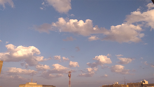
Actual result: 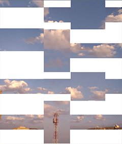
I added the codes below as well as uploaded the codes and image(s) to drive:
The link to drive: https://drive.google.com/drive/folders/1rOmjAniDTHqtH1hxvfdRC1YmHRSJ6qmm?usp=sharing
HTML
    <html>
<head>
<title>Image</title>
<link rel="stylesheet" href="mystyle.css">
<meta http-equiv="Content-Type" content="text/html; charset=utf-8">
</head>
<body bgcolor="#FFFFFF" leftmargin="0" topmargin="0" marginwidth="0" marginheight="0">
<!-- Save for Web Slices (20200123_170249.jpg) -->
<table id="Table_01" class="center" width="1001" height="564" border="0" cellpadding="0" cellspacing="0">
    <tr>
        <td>
            <img src="images/20200123_170249_01.png" width="413" height="68" alt=""></td>
        <td colspan="2" rowspan="2">
            <img src="images/20200123_170249_02.png" width="251" height="141" alt=""></td>
        <td rowspan="2">
            <img src="images/20200123_170249_03.png" width="169" height="141" alt=""></td>
        <td rowspan="2">
            <img src="images/20200123_170249_04.png" width="167" height="141" alt=""></td>
        <td>
            <img src="images/spacer.gif" width="1" height="68" alt=""></td>
    </tr>
    <tr>
        <td rowspan="2">
            <img src="images/20200123_170249_05.png" width="413" height="214" alt=""></td>
        <td>
            <img src="images/spacer.gif" width="1" height="73" alt=""></td>
    </tr>
    <tr>
        <td>
            <img src="images/20200123_170249_06.png" width="87" height="141" alt=""></td>
        <td colspan="2">
            <img src="images/20200123_170249_07.png" width="333" height="141" alt=""></td>
        <td>
            <img src="images/20200123_170249_08.png" width="167" height="141" alt=""></td>
        <td>
            <img src="images/spacer.gif" width="1" height="141" alt=""></td>
    </tr>
    <tr>
        <td>
            <img src="images/20200123_170249_09.png" width="413" height="140" alt=""></td>
        <td colspan="2">
            <img src="images/20200123_170249_10.png" width="251" height="140" alt=""></td>
        <td>
            <img src="images/20200123_170249_11.png" width="169" height="140" alt=""></td>
        <td>
            <img src="images/20200123_170249_12.png" width="167" height="140" alt=""></td>
        <td>
            <img src="images/spacer.gif" width="1" height="140" alt=""></td>
    </tr>
    <tr>
        <td>
            <img src="images/20200123_170249_13.png" width="413" height="141" alt=""></td>
        <td>
            <img src="images/20200123_170249_14.png" width="87" height="141" alt=""></td>
        <td colspan="2">
            <img src="images/20200123_170249_15.png" width="333" height="141" alt=""></td>
        <td>
            <img src="images/20200123_170249_16.png" width="167" height="141" alt=""></td>
        <td>
            <img src="images/spacer.gif" width="1" height="141" alt=""></td>
    </tr>
    <tr>
        <td>
            <img src="images/spacer.gif" width="413" height="1" alt=""></td>
        <td>
            <img src="images/spacer.gif" width="87" height="1" alt=""></td>
        <td>
            <img src="images/spacer.gif" width="164" height="1" alt=""></td>
        <td>
            <img src="images/spacer.gif" width="169" height="1" alt=""></td>
        <td>
            <img src="images/spacer.gif" width="167" height="1" alt=""></td>
        <td></td>
    </tr>
</table>
<!-- End Save for Web Slices -->
</body>
</html>
CSS
    <style>

.center {
  margin-left: auto;
  margin-right: auto;
}

</style>
Thank you in advance!
Solution
Like I already said within the comments it would be the easiest way to wrap all the images in a single div and use CSS-Grid on the container. You have a total width of 1001px to cover as such create a 1001-column grid with grid-template-columns: repeat(1001, 1fr);
Then define the grid position of the images like this (i just used the first 8 pictures for demonstration):
.container {
  display: grid;
  grid-template-columns: repeat(1001, 1fr);
}

img {
  width: 100%;
}

img:nth-child(1) {
  grid-column: 1 / 414;
  grid-row: 1 / 69;
}

img:nth-child(2) {
  grid-column: 414 / 665;
  grid-row: 1 / 142;
}

img:nth-child(3) {
  grid-column: 665 / 834;
  grid-row: 1 / 142;
}

img:nth-child(4) {
  grid-column: 834 / 1002;
  grid-row: 1 / 142;
}

img:nth-child(5) {
  grid-column: 1 / 414;
  grid-row: 69 / 283;
}

img:nth-child(6) {
  grid-column: 414 / 501;
  grid-row: 142 / 283;
}

img:nth-child(7) {
  grid-column: 501 / 834;
  grid-row: 142 / 283;
}

img:nth-child(8) {
  grid-column: 834 / 1002;
  grid-row: 142 / 283;
}
<div class="container">
<img src="https://drive.google.com/uc?id=1xYmDtoApToQLcDttXU2VAK5kxZrcgWG6">
<img src="https://drive.google.com/uc?id=10aRjEU_h46dvz6M8jAWbZDSXM5Ezl-t5">
<img src="https://drive.google.com/uc?id=1A6Rjr1sEK0XEIrSdfoe6asVSHMbvX3F-">
<img src="https://drive.google.com/uc?id=1VB8EaN-U789wBXvHtuXFEttTu7esk1WZ">
<img src="https://drive.google.com/uc?id=1u3a4154gk4lNmzdCu3IEpgKSHd24ZAOD">
<img src="https://drive.google.com/uc?id=1b7_1DGc_x7lctn4J6aFoQ4x_uXMeZlRX">
<img src="https://drive.google.com/uc?id=1KEoi_cIAnK1dxtOxW3aK1Dtc5R87Ej0k">
<img src="https://drive.google.com/uc?id=153dLnHVKVFafuEXTdvQx9CO8R7Oxy6sw">
</div>Answered By - tacoshy


0 comments:
Post a Comment
Note: Only a member of this blog may post a comment.