
Issue
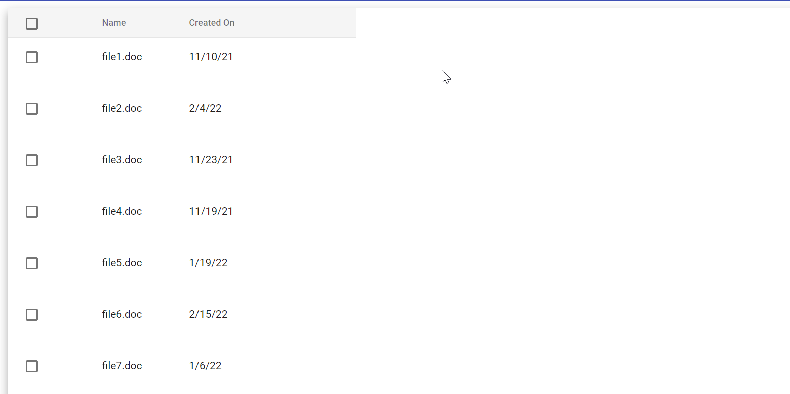
So I'm trying to build a Material data-table with pagination, sorting and filtering in Angular that displays the files that are stored in an Azure storage account. You can download the files that you have selected with the checkboxes on the left.
What I'm currently stuck on is the next step, which is to toggle on expansion and show the description of the file when you click its row accordingly. I've tried to follow this tutorial and multiple others, but am currently facing the following issue:
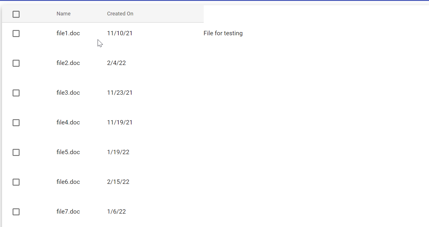 What is working is that the extra data shows up when I click on a row, however I would like for it to show up underneath the row, not next to it on the same line and get rid of the whitespace on the right side of the table.
Any help on how to do this would be greatly appreciated, thank you! I don't know if this is just a styling issue or something else but I've been trying to solve this for a long time now and am certain that I missed something somewhere and/or did something wrong.
html
<table mat-table [dataSource]="dataSource" class="full-width-table" matSort multiTemplateDataRows>

      <ng-container matColumnDef="select">
        <th class="select-column" mat-header-cell *matHeaderCellDef>
          <mat-checkbox color="primary" (change)="$event ? selectAllToggle() : null"
                        [checked]="selection.hasValue() && isAllSelected()"
                        [indeterminate]="selection.hasValue() && !isAllSelected()">
          </mat-checkbox>
            <mat-icon class="download-button" title="Click here to download the selected files" (click)="downloadSelected()" *ngIf="selection.hasValue()">save_alt</mat-icon>
        </th>
        <td mat-cell *matCellDef="let row">
          <mat-checkbox color="primary" (click)="$event.stopPropagation()"
                        (change)="$event ? selection.toggle(row) : null"
                        [checked]="selection.isSelected(row)">
          </mat-checkbox>
        </td>
      </ng-container>

      <ng-container matColumnDef="name">
        <th mat-header-cell *matHeaderCellDef mat-sort-header> Name </th>
        <td mat-cell *matCellDef="let element"> {{element.name}} </td>
      </ng-container>

      <ng-container matColumnDef="createdOn">
        <th mat-header-cell *matHeaderCellDef mat-sort-header> Created On </th>
        <td mat-cell *matCellDef="let element"> {{element.createdOn | date:'shortDate'}} </td>
      </ng-container>

      <ng-container matColumnDef="expandedDetail">
        <td mat-cell *matCellDef="let element" [attr.colspan]="displayedColumns.length">
          <div class="element-detail" [@detailExpand]="element.isExpanded ? 'expanded' : 'collapsed'">
              {{element.fileInfo}}
          </div>
        </td>
      </ng-container>

      <tr mat-header-row *matHeaderRowDef="displayedColumns"></tr>
      <tr mat-row *matRowDef="let element; columns: displayedColumns;" class="element-row"
        [class.expanded-row]="element.isExpanded" (click)="toggleRow(element)">
      </tr>
      <tr *matRowDef="let row; columns: ['expandedDetail']" class="detail-row"></tr>

    </table>
ts
import { Component, OnInit, ViewChild, AfterViewInit } from '@angular/core';
import { ApiService } from '../api.services';
import { animate, state, style, transition, trigger } from '@angular/animations';
import { MatSort } from '@angular/material/sort';
import { IBlobData } from '../blob-data';
import { Subscription } from 'rxjs';
import { MatTableDataSource } from '@angular/material/table';
import { HttpErrorResponse } from '@angular/common/http';
import { SelectionModel } from '@angular/cdk/collections';
import { MatPaginator } from '@angular/material/paginator';

@Component({
  selector: 'app-home',
  templateUrl: './home.component.html',
  styleUrls: ['./home.component.css'],
  animations: [
    trigger('detailExpand', [
      state('collapsed', style({ height: '0px', minHeight: '0' })),
      state('expanded', style({ height: '*' })),
      transition('expanded <=> collapsed', animate('225ms cubic-bezier(0.4, 0.0, 0.2, 1)')),
    ]),
  ],
})

export class HomeComponent implements OnInit {

  blobs: any;
  filterBlobs: any[] = [];
  filterTerm: string = '';

  private subs = new Subscription();

  displayedColumns: any[] = [ 'select', 'name', 'createdOn'];
  selection = new SelectionModel<IBlobData>(true, []);
  public dataSource!: MatTableDataSource<IBlobData>;

  constructor(private api: ApiService) { }

  // configure sorting and paginator
  @ViewChild(MatSort, { static: false }) sort!: MatSort;
  @ViewChild('paginator') paginator!: MatPaginator;

  async ngOnInit() {
    // subscribe to file data from api
    this.subs.add(this.api.getBlobData()
    .subscribe((res) => {
      this.blobs = res;
      this.dataSource = new MatTableDataSource<IBlobData>(this.blobs); /* fill table with blob data */
      this.dataSource.paginator = this.paginator; /* pagination on table */
      this.dataSource.sort = this.sort; /* sorting on table */

      // filter on table
      this.dataSource.filterPredicate = function (data, filter) {
      return data.name.toLowerCase().includes(filter.toLowerCase());
      }
    },
    (err: HttpErrorResponse) => {
      console.log(err);
    }));
  }

  ngOnDestroy() {
    if (this.subs) {
      this.subs.unsubscribe();
    }
  }

  toggleRow(element: { isExpanded: boolean; }) {
    element.isExpanded = !element.isExpanded;
  }

}

// some functions unrelated to this post where removed
css
table {
  width: 100%;
  overflow-x: auto;
  overflow-y: hidden;
  min-width: 500px;
}

th.mat-header-cell {
  text-align: left;
  max-width: 300px;
}

tr.mat-header-row {
  height: 40px !important;
  background-color: whitesmoke;
}

.select-column {
  width: 10%;
}

.download-button {
  margin-left: 15px;
  border: none;
  width: 5%;
  cursor: pointer;
  vertical-align: middle;
}

.detail-row {
  height: 0;
  min-height: auto;
  display: inline-block;
  width: 100%;
}

.element-row td {
  border-bottom-width: 0;
}

.element-detail {
  overflow: hidden;
  display: flex;
  width: 100%;
}

.detail-table {
  background: #b7b7b773;
  text-align: center;
}
SOLUTION: I used the expansion panel from material to get my wanted results.

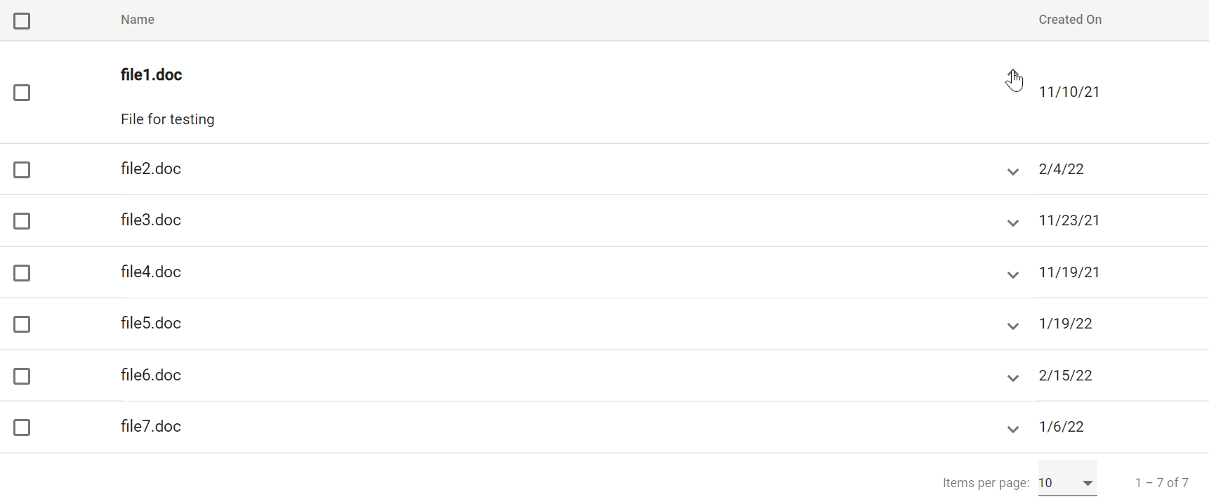
html
<ng-container matColumnDef="name">
            <th mat-header-cell *matHeaderCellDef mat-sort-header> Name </th>
            <td mat-cell *matCellDef="let element">
              <mat-expansion-panel (opened)="element.isExpanded = true"
              (closed)="element.isExpanded = false">
                <mat-expansion-panel-header>
                  <mat-panel-title [ngClass]="element.isExpanded ? 'expanded-title': ''">
                    {{element.name}}
                  </mat-panel-title>
                </mat-expansion-panel-header>
                <p>{{element.fileInfo}}</p>
              </mat-expansion-panel>
              </td>
          </ng-container>
css
/* overwrite default material styling */
.mat-expansion-panel {
  box-shadow: none !important;
  padding: 0 !important;
}

.mat-expansion-panel-header {
  padding: 0 20px 0 0!important;
}

.mat-expansion-panel-body {
  padding: 0 !important;
}
ts
/* in my data file */
export interface IData {
    name: string,
    createdOn: string,
    fileInfo: string
    isExpanded: boolean;
}

/* in component.ts file */
isExpanded = false;
Solution
You can use MatExpensionPanel, you've got an example here https://material.angular.io/components/expansion/examples.
Answered By - Baptiste Borel


0 comments:
Post a Comment
Note: Only a member of this blog may post a comment.