
Issue
I am not very well versed in HTML and CSS. I am currently building a web application using Django and I integrated a sidebar into my web application using Bootstrap, but it has messed my layouts, and I can't seem to figure out how to move the content in a block to the left of side of my sidebar.
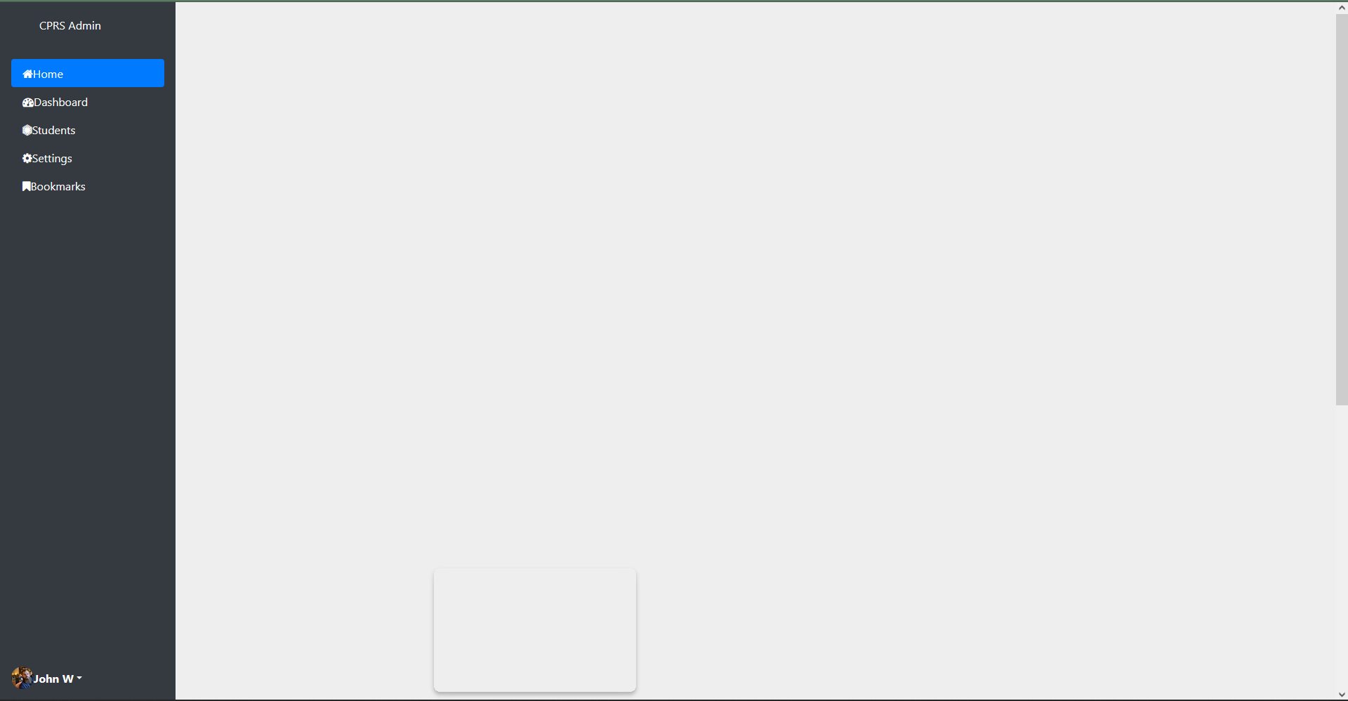

As seen in the pictures above, my sidebar is located at the top and my content is located at the bottom. Below are my codes for my sidebar and the base template.
sidebar_template.html
<div class="d-flex flex-column vh-100 flex-shrink-0 p-3 text-white bg-dark sidebar-height" style="width: 250px;"> <a href="/" class="d-flex align-items-center mb-3 mb-md-0 me-md-auto text-white text-decoration-none"> <svg class="bi me-2" width="40" height="32"> </svg> <span class="fs-4">CPRS Admin</span> </a>
    <hr>
    <ul class="nav nav-pills flex-column mb-auto">
        <li class="nav-item"> <a href="#" class="nav-link active" aria-current="page"> <i class="fa fa-home"></i><span class="ms-2">Home</span> </a> </li>
        <li> <a href="{% url 'coordinator_dashboard' %}" class="nav-link text-white"> <i class="fa fa-dashboard"></i><span class="ms-2">Dashboard</span> </a> </li>
        <li> <a href="{% url 'coordinator_view_students' %}" class="nav-link text-white"> <i class="fa fa-first-order"></i><span class="ms-2">Students</span> </a> </li>
        <li> <a href="#" class="nav-link text-white"> <i class="fa fa-cog"></i><span class="ms-2">Settings</span> </a> </li>
        <li> <a href="#" class="nav-link text-white"> <i class="fa fa-bookmark"></i><span class="ms-2">Bookmarks</span> </a> </li>
    </ul>
    <hr>
    <div class="dropdown"> <a href="#" class="d-flex align-items-center text-white text-decoration-none dropdown-toggle" id="dropdownUser1" data-bs-toggle="dropdown" aria-expanded="false"> <img src="https://github.com/mdo.png" alt="" width="32" height="32" class="rounded-circle me-2"> <strong> John W </strong> </a>
        <ul class="dropdown-menu dropdown-menu-dark text-small shadow" aria-labelledby="dropdownUser1">
            <li><a class="dropdown-item" href="#">New project</a></li>
            <li><a class="dropdown-item" href="#">Settings</a></li>
            <li><a class="dropdown-item" href="#">Profile</a></li>
            <li>
                <hr class="dropdown-divider">
            </li>
            <li><a class="dropdown-item" href="#">Sign out</a></li>
        </ul>
    </div>
</div>
base.html
{% load static %}
<!DOCTYPE html>
<html>
<head>
<title>Capstone Project</title>
<link href="{% static 'css/bootstrap.min.css' %}" rel="stylesheet">
<script src="{% static 'js/bootstrap.min.js' %}"></script>
<script src="https://cdnjs.cloudflare.com/ajax/libs/jquery/3.2.1/jquery.min.js"></script>
<link href="{% static 'css/main.css' %}" rel="stylesheet">
<link href="{% static 'css/profile.css' %}" rel="stylesheet">
<link href="{% static 'css/sidebar.css' %}" rel="stylesheet">
<link href="https://cdnjs.cloudflare.com/ajax/libs/font-awesome/4.7.0/css/font-awesome.min.css" rel="stylesheet">
</head>
<body>
<div class="page-container">
<div class="content-wrap">
<div class="">
{% if user.is_authenticated and user.is_superuser %}
{% include 'HOD/sidebar_template.html' %}
{% endif %}
</div>
<div class="col">
{% block content %}
{% endblock content %}
</div>
</div>
</div>
<!-- Optional Javascript -->
{% block custom_js %}
{% endblock custom_js %}
</body>
<!-- Site footer -->
<footer class="footer">
<div class="container text-center">
<small>Copyright © Your Website</small>
</div>
</footer>
</html>
Can someone help me fix the layouts ? Thanks.
Solution
This is a bootstrap issue, not a django issue. You have to wrap your head around how the bootstrap grid works.
You have to first create a row element which can contain one or more columns. When you create the columns you get to decide their behavior according to screen size, or to just let them figure out their sizing by themselves.
This will create two equally sized columns that will take up whatever width space available.
<div class="row">
    <div class="col">
        content
    </div>
    <div class="col">
        content
    </div>
</div>
If you want to define the width of each column in relation to the total width of the page, you can define that when you create the columns. Here you can specify different behaviors for different screen sizes in order to make your site responsive.
 <div class="row">
        <div class="col-3 col-lg-2">
           This column will be 3/12 of the screen on small and medium screens. Or 2/12 of the screen on large screens and up.
        </div>
        <div class="col-9 col-lg-10">
            This column will be 9/12 of the screen on small and medium screens. Or 10/12 of the screen on large screens and up.
        </div>
    </div>
And in your specific case i'd suggest something like this:
<div class="page-container">
    <div class="content-wrap">
        <div class="row">
            <div class="col-3">
                {% if user.is_authenticated and user.is_superuser %}
                        {% include 'HOD/sidebar_template.html' %}
                {% endif %}
            </div>
            <div class="col-9">
                {% block content %}
                {% endblock content %}
            </div>
        </div>
    </div>
</div>
Answered By - Beikeni


0 comments:
Post a Comment
Note: Only a member of this blog may post a comment.