
Issue
I am using primeng to create a dialog with tabs, this is my template:
<p-dialog [(visible)]="displayDialog" (onHide)="cancel()" [style]="{width: '50vw'}" [baseZIndex]="10000">
  <p-tabView [controlClose]="displayDialog">
    <p-tabPanel header="Header 1" [headerStyle]='{"width": "70px"}'>Text 1</p-tabPanel>
    <p-tabPanel header="Header 2" [headerStyle]='{"width": "70px"}'> Text 2</p-tabPanel>
    <p-tabPanel header="Header 3" [headerStyle]='{"width": "70px"}'>Tex 3</p-tabPanel>
  </p-tabView>
</p-dialog>
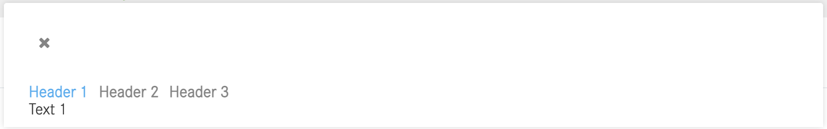
I get this as a result
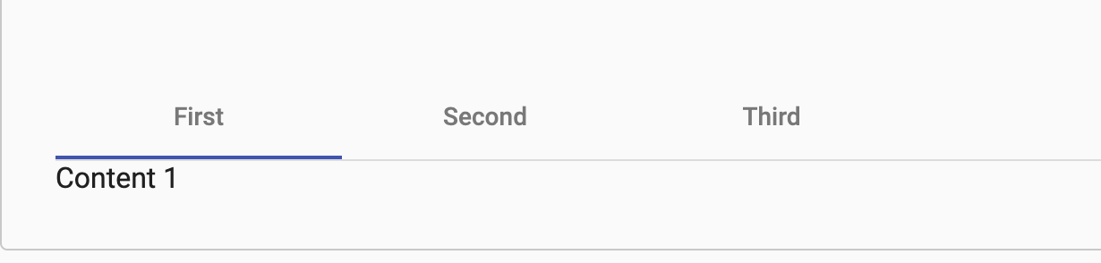
However, I would like to have it like Angular Material: (matDialog)
<mat-tab-group>
  <mat-tab label="First"> Content 1 </mat-tab>
  <mat-tab label="Second"> Content 2 </mat-tab>
  <mat-tab label="Third"> Content 3 </mat-tab>
</mat-tab-group>
Is there a way to have it like Angular Material using PrimeNG?
Solution
Yes, PrimeNG supports Material theme. These are the Material themes (with prefix: md):
primeng/resources/themes/md-light-indigo/theme.css
primeng/resources/themes/md-light-deeppurple/theme.css
primeng/resources/themes/md-dark-indigo/theme.css
primeng/resources/themes/md-dark-deeppurple/theme.css
primeng/resources/themes/mdc-light-indigo/theme.css
primeng/resources/themes/mdc-light-deeppurple/theme.css
primeng/resources/themes/mdc-dark-indigo/theme.css
primeng/resources/themes/mdc-dark-deeppurple/theme.css
Hence, you don't need to switch the PrimeNG component to the Angular Material component as you can adopt the Material theme.
You can import desired Material theme by:
Solution 1: Add theme to angular.json
angular.json
"styles": [
  "node_modules/primeng/resources/themes/md-light-indigo/theme.css"
]
Sample Solution 1 on StackBlitz
Solution 2: Import theme to the global stylesheet
style.css
@import 'primeng/resources/themes/md-light-indigo/theme.css';
Sample Solution 2 on StackBlitz
Answered By - Yong Shun


0 comments:
Post a Comment
Note: Only a member of this blog may post a comment.