
Issue
I have been trying many different methods to achieve the following but could not.
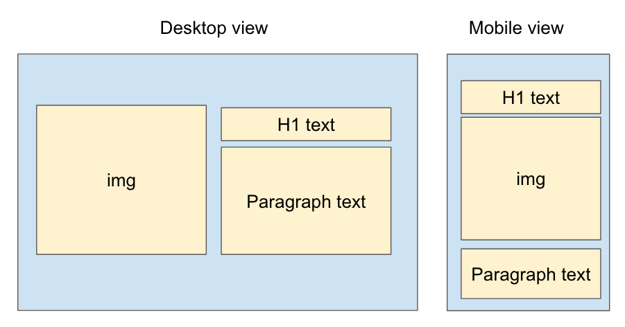
I tried using media query to change the order of the children within the flex box of the div that contains all 3 but it seems like I can only do so when all 3 children are divs. However when all 3 children are divs, I cannot achieve the desktop outcome. Basically the header and the paragraph text will each take a column.
Any help would be greatly appreciated.
Exiting code: https://codepen.io/lionellloh/pen/BawVpjm
<div class="parent">
  <img src="https://upload.wikimedia.org/wikipedia/commons/2/27/Red_square.svg">
  <h1> This is a header </h1>
  <p> This is some body text that is very interesting </p>

 </div>
.parent {
  display: flex;
  flex-wrap: wrap;
}

@media only screen and (max-width: 900px) {
    .parent :nth-child(1) {
        order: 2;
    }

    .parent :nth-child(2) {
        order: 1;
    }

    .parent :nth-child(3) {
        order: 3;
    }
}
Solution
You may like to look at grid which will allow you to name areas and assign elements to them.
Then you can redefine the areas when the max-width is at some value.
This saves having to go through all the affected elements and specify their order.
Here's a simple snippet. It puts a background color on each element so you can see which is being allocated to where.
Obviously you'll want to look at exactly the proportions you want the header to take up compared to the paragraph and so on but this is to get you started.
.container {
  display: grid;
  min-width: 600px;
  width: 25%;
  aspect-ratio: 1 / 1;
  gap: 10px;
  grid-template-areas:
    'I H'
    'I P'
    'I P'
    'I P';
  background: pink;
  grid-template-columns: 1fr 1fr;
}
h1 {
  grid-area: H;
  background: cyan;
}
img {
  grid-area: I;
  background: magenta;
  object-fit: cover;
  width: 100%;
  height: 100%;
}
p {
  grid-area: P;
  background: yellow;
}
@media (max-width: 600px) {
  .container {
    grid-template-areas:
      'H'
      'I'
      'P';
  }
}
<div class="container">
<h1>Heading</h1>
<img src="https://picsum.photos/id/1015/200/600">
<p>Paragraph text<br>Paragraph text<br>Paragraph text<br>Paragraph text<br>Paragraph text<br></p>
</div>Answered By - A Haworth


0 comments:
Post a Comment
Note: Only a member of this blog may post a comment.