
Issue
Let's say we have simple div and his width != height.
<div id="test"></div>
and css looks like:
#test {
    width: 200px;
    height: 50px;
    border-radius: 30%;
    border: 5px solid black;
}
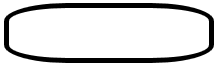
The border-radius in percentage makes longer side more curved. This value in px would make border equally curved:
#test{
    border-radius: 30px;
}
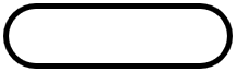
My question is, is there a way (using CSS) to manipulate this proportion in px (independent from changing div size) and make for example shorter side of div more curved? Or it's only achievable via canvas.
Solution
You can use two values with a slash in between if you want all rounded corners look the same, or you can use selectors for the single corners and use two values without a slash to get independent results for each corner, like border-top-left-radius: 45px 80px;
Here are three examples (I added a symmetric one, similar to the one in your question):
.x {
  width: 300px;
  height: 200px;
  border: 2px solid green;
  border-radius: 45px / 80px;
}
.y {
  width: 300px;
  height: 200px;
  margin-top: 30px;
  border: 2px solid red;
  border-top-left-radius: 45px 80px;
  border-top-right-radius: 125px 60px;
}
.z {
  width: 300px;
  height: 100px;
  margin-top: 30px;
  border: 2px solid blue;
  border-top-left-radius: 80px 65px;
  border-bottom-left-radius: 80px 65px;
  border-top-right-radius: 80px 65px;
  border-bottom-right-radius: 80px 65px;
}
<div class="x"></div>
<div class="y"></div>
<div class="z"></div>Answered By - Johannes


0 comments:
Post a Comment
Note: Only a member of this blog may post a comment.