
Issue
I'm trying to resize a button in mobile perspective but its text doesn't resize too. I'm trying to do it in mobile perspective. Maybe I should use flex in this case.
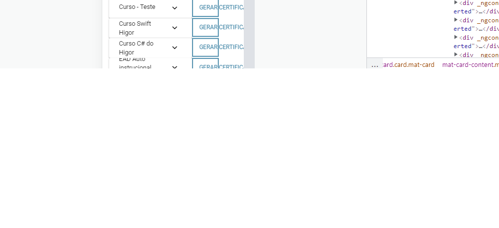
HTML:
<ng-container matColumnDef="acoes" style=" position: left;" >
          <button mat-stroked-button color="primary" (click)="gerarCertificado(inscricao)" class="width-button">GERAR CERTIFICADO<mat-icon class="md-15">play_arrow</mat-icon> </button>
      </ng-container>
CSS:
  @media (max-width: 480px) {
    .width-button{
        max-width: 2%;
    }
  }
Solution
Just modify the font-size and the button will adjust accordingly.
button {
  padding: .5rem 1rem;
  font-size: 1.2rem;
}

/*
   You would put this code in your media query, but I'm just emulating the
   device with a class for the example.
*/
button.mobile {
  font-size: .8rem;
}
<button>Desktop</button>
<button class="mobile">Mobile</button>Answered By - sno2


0 comments:
Post a Comment
Note: Only a member of this blog may post a comment.