
Issue
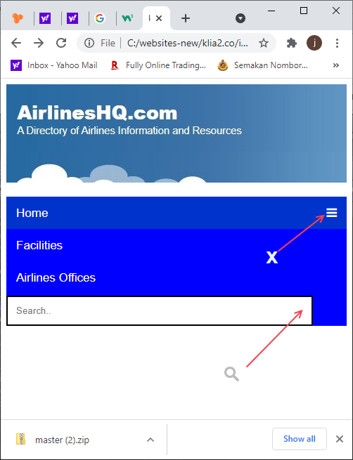
Please help me. What should I add or edit in my code in order to display the icons in the right place as I show in the following image:
HTML Code
    <header id="logo"></header>


    <div class="navbar" id="nav">
      <a href="https://klia2.co" class="active">Home</a>
      <a href="../facilities/index.htm">Facilities</a>
      <a href="../airlines/index.htm">Airlines Offices</a>
       <input type="text" placeholder="Search..">
         <a href="javascript:void(0);" class="icon" onclick="myFunction()"><i class="fa fa-bars"></i>
  </a>  </div>

</div>

    <script>
        function myFunction() {
          var x = document.getElementById("nav");
          if (x.className === "navbar") {
            x.className += " responsive";
          } else {
            x.className = "navbar";
          }
        }


</script>
CSS Code
.navbar {
      overflow: hidden;
      background-color: #0000ff;


      }


    .navbar a {
      float: left;
      display: block;
      color: white;
      text-align: center;
      padding: 14px 14px;
      text-decoration: none;
      font-size: 17px;
      height:18px;


    }

    .active {
      background-color: #0033CC;
      color: white;


    }

    .navbar .icon {
      display: none;


    }


    .navbar a:hover, input:hover {
      background-color: #dddddd;
      color: black;


    }

    /* CSS for search box */
    .navbar input[type=text] {
      float: right;
      padding: 12px;
      border: none;
      margin-top: 3px;
      margin-right: 5px;


}


    @media screen and (max-width: 600px) {
      .navbar a, .navbar input {
        display: none;

      }
      .navbar a.icon {
        float: left;
        display: block;

      }
    }

    @media screen and (max-width: 600px) {
      .navbar.responsive {position:relative;}
      .navbar.responsive .icon {
        position: absolute;
        right: 0;
        top: 0;

      }
      .navbar.responsive a {
        float: none;
        display: block;
        text-align: left;

      }

      .navbar.responsive input {
        float: none;
        display: block;
        width: 90%;
        padding: 12px;
        border: 2px solid black;
        text-align: left;


      }

    }
Note: For search box I need to make it HTML form and the font awesome search icon to be submit button not just normal HTML icon tag. Thanks in advance!
Solution
To achieve this just update your HTML with following code
<header id="logo"></header>
<div class="navbar" id="nav">
  <a href="https://klia2.co" class="active">Home</a>
  <a href="../facilities/index.htm">Facilities</a>
  <a href="../airlines/index.htm">Airlines Offices</a>
  <form class="search-box">
    <input type="text" placeholder="Search..">
    <button type="submit" class="search-icon"><i class="fa fa-search"></i></button>

  </form>

  <a href="javascript:void(0);" class="icon" onclick="myFunction()"><i class="fa fa-bars"></i></a>
</div>

<script>
    function myFunction() {
      var x = document.getElementById("nav");

      console.log(barIcon)
      if (x.className === "navbar") {
        x.className += " responsive";
        var barIcon = document.getElementsByClassName('fa-bars')[0];
        barIcon.classList.add("fa-times");
        barIcon.classList.remove("fa-bars");
      } else {
        var closeIcon = document.getElementsByClassName('fa-times')[0];
        closeIcon.classList.remove("fa-times");
        closeIcon.classList.add("fa-bars");
        x.className = "navbar";
      }
    }
</script>
and Your CSS with the following
.navbar {
  overflow: hidden;
  background-color: #0000ff;
}

.navbar a {
  float: left;
  display: block;
  color: white;
  text-align: center;
  padding: 14px 14px;
  text-decoration: none;
  font-size: 17px;
  height:18px;


}
.active {
  background-color: #0033CC;
  color: white;


}
.navbar .icon {
  display: none;


}
.navbar a:hover, input:hover {
  background-color: #dddddd;
  color: black;
}
/* CSS for search box */
.navbar .search-box {
  float: right;
  position: relative;
  margin-top: 3px;
  padding-right: 30px;
  display: flex;
}
.navbar .search-box input {
  padding: 12px;
  border: none;
  width: 100%;
  height: 100%;
  padding: 10px;
}
.navbar .search-box button {
  color: #999;
  border: navajowhite;
  padding: 10px;
}

@media screen and (max-width: 600px) {
  .navbar a, .navbar .search-box, .navbar .search-icon {
    display: none;

  }
  .navbar a.icon {
    float: left;
    display: block;

  }
}

@media screen and (max-width: 600px) {
  .navbar.responsive {position:relative;}
  .navbar.responsive .icon {
    position: absolute;
    right: 0;
    top: 0;

  }
  .navbar.responsive a {
    float: none;
    display: block;
    text-align: left;

  }

  .navbar.responsive .search-box {
    float: none;
    display: flex;
    width: 90%;
    padding: 4%;
    border: 2px solid black;
  }
  .navbar.responsive .search-icon{
    display: flex;
  }
}
Enjoy!
Answered By - Abdulrahman Hatem


0 comments:
Post a Comment
Note: Only a member of this blog may post a comment.